Rebranding Rede Américas





















Rede Américas: Strategy, Brand Architecture, and Identity
Rede Américas brings together diverse hospitals, specialties, and audiences under a single brand. With the consolidation of this structure, the challenge was to organize its portfolio and strengthen brand awareness for the network, while preserving the history and distinct characteristics of each institution.
To address this challenge, we developed a comprehensive rebranding project integrating strategy, brand architecture, visual identity, and verbal identity. The work began with a strategic investigation to define the principles guiding the brand's evolution—balancing unity and diversity, excellence and care, consistency and flexibility.
The brand architecture established hierarchies and defined the relationships between the masterbrand, the various positioning tiers, and the individual hospital brands. This framework now guides how each institution expresses itself within the portfolio, harmonizing recognition, differentiation, and coherence.
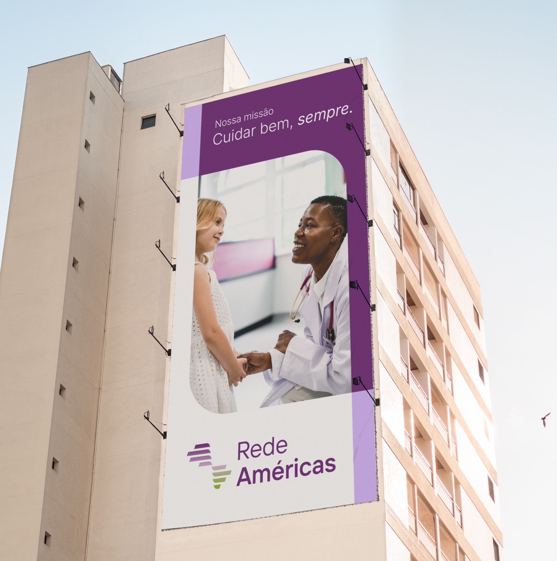
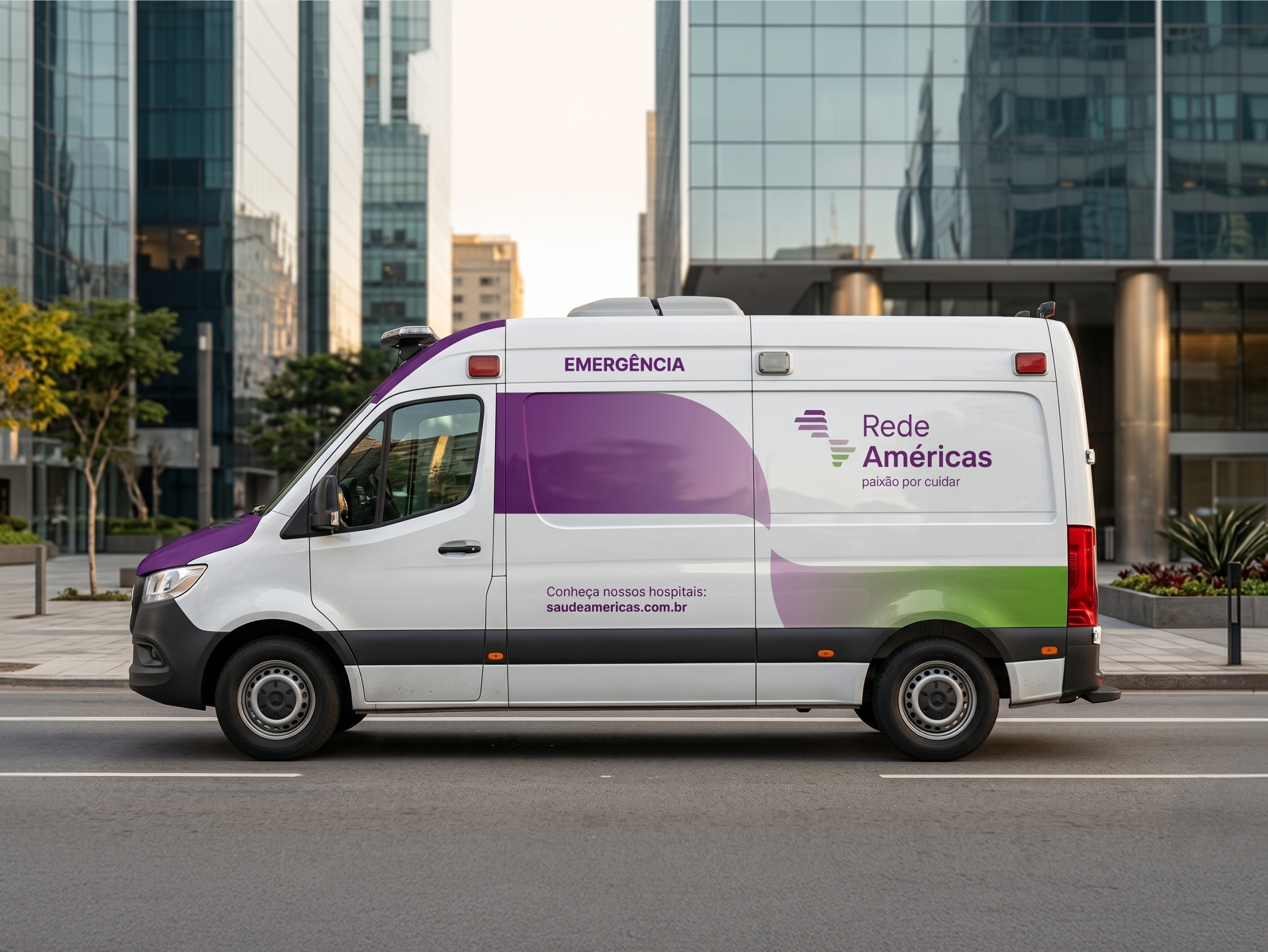
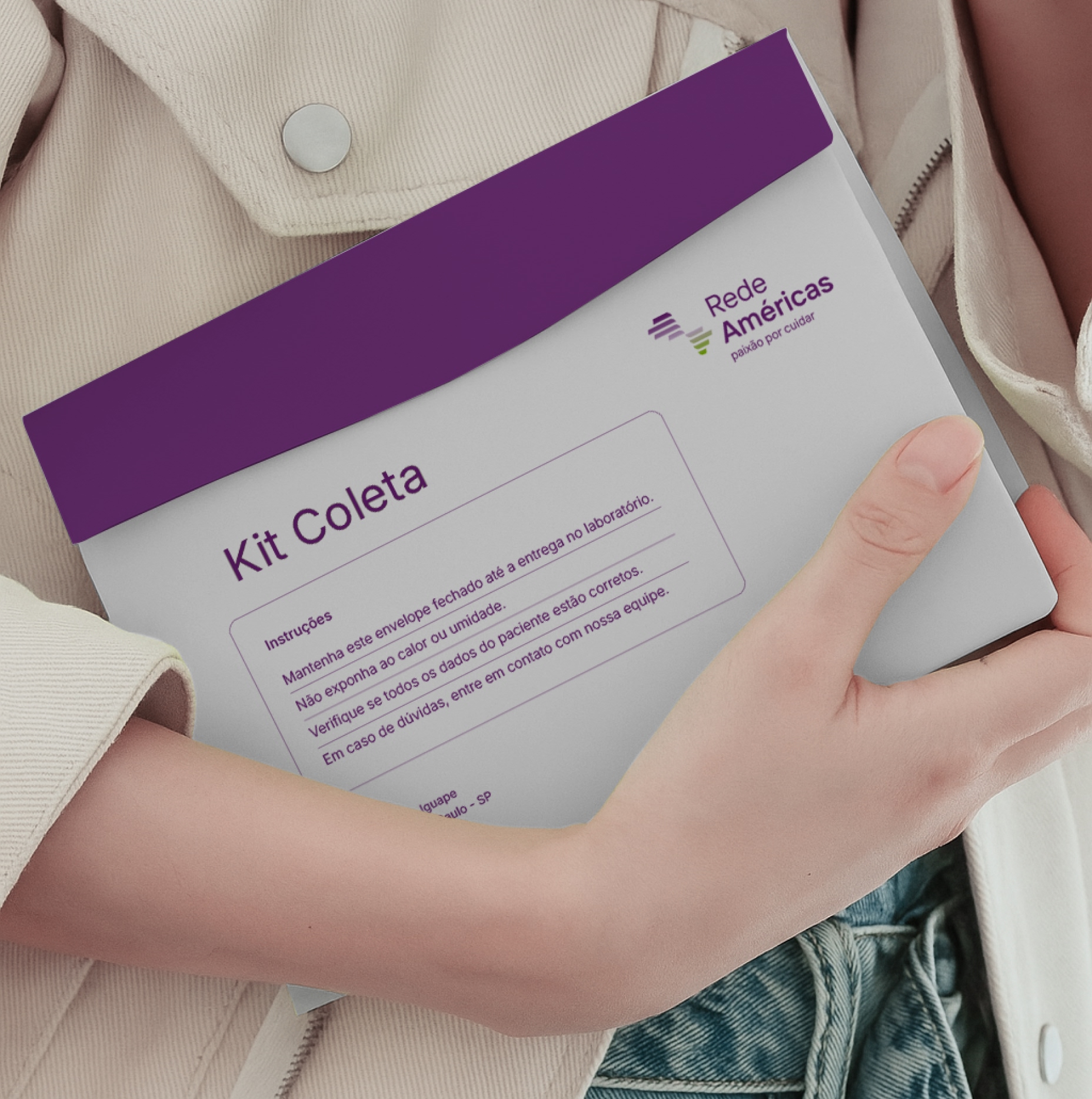
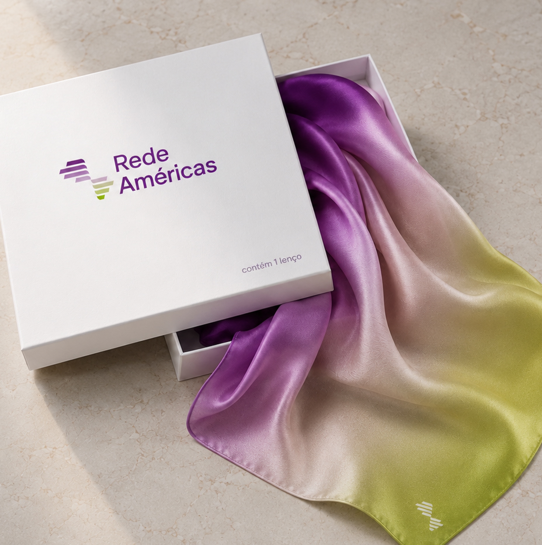
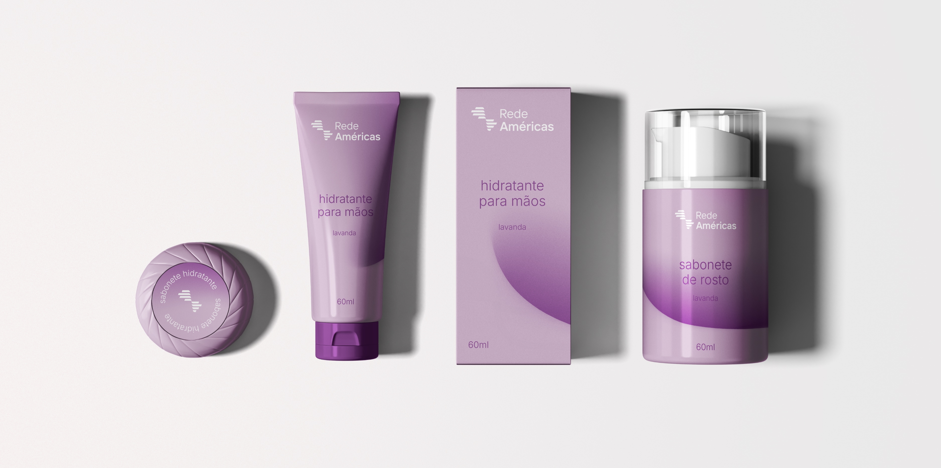
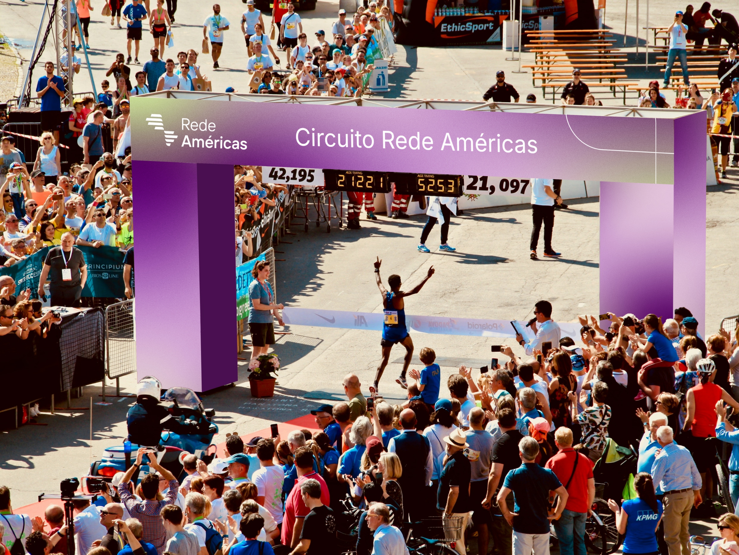
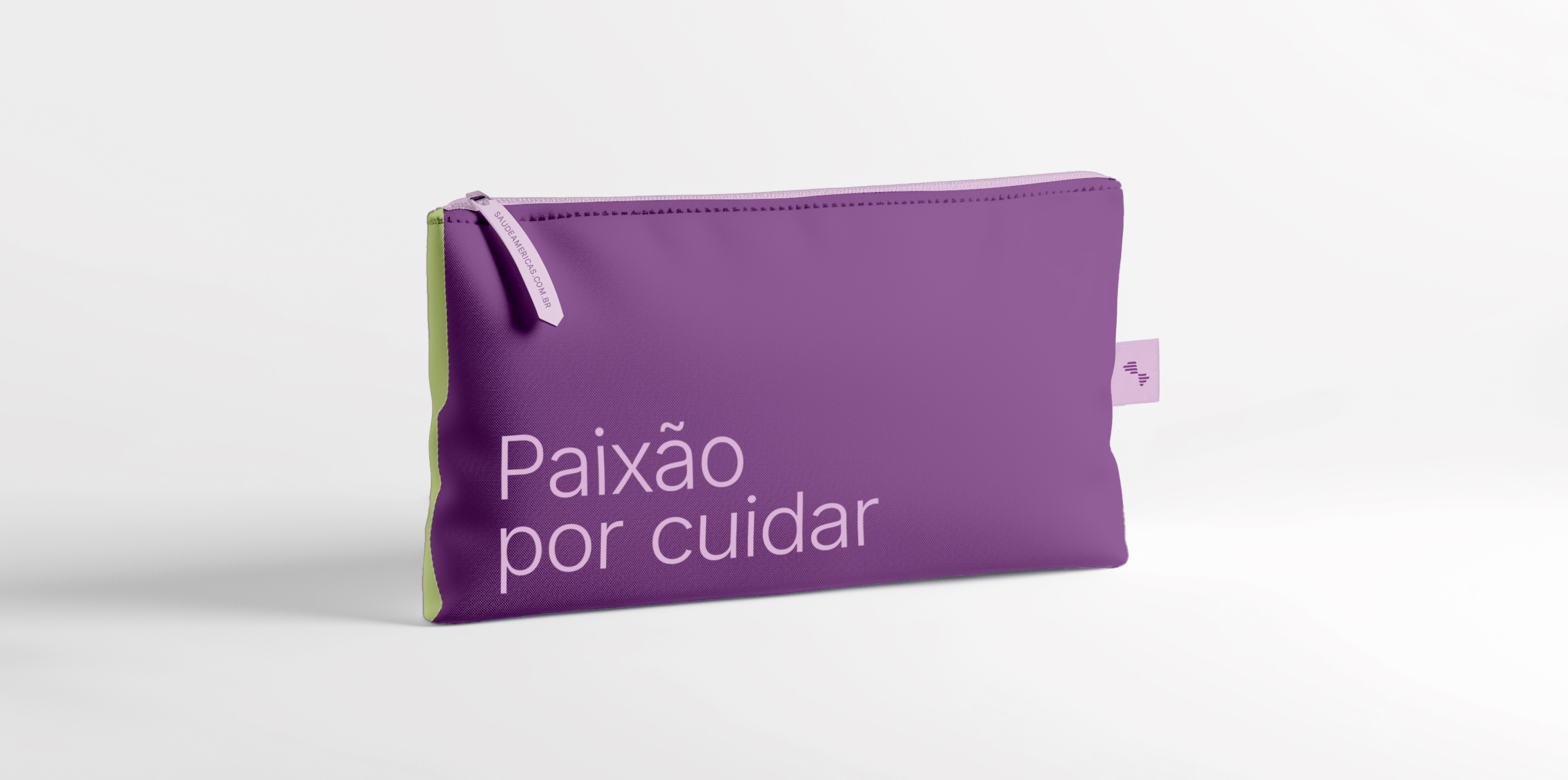
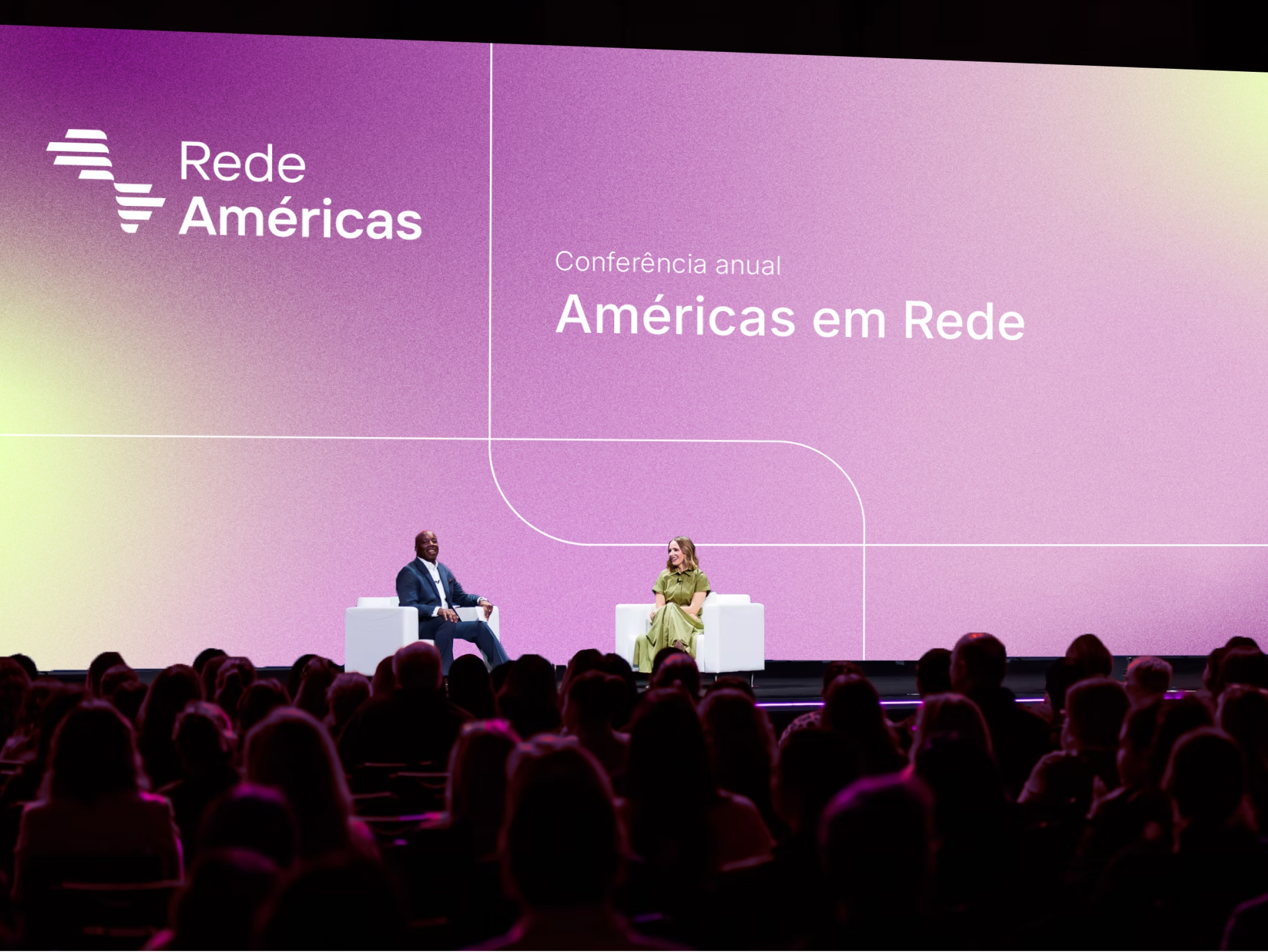
For the visual identity, we reviewed existing elements and evolved their design language to align with the new architecture. We developed guidelines for color palettes, typography, composition, photography, and graphic assets, establishing a consistent and flexible visual system equipped for diverse contexts and communication needs.
The project also encompassed Rede Américas' verbal identity, defining the tone of voice and core communication principles. This effort culminated in strategic guides for internal and external audiences, featuring specific guidelines to support the different hospitals and ensure a consistent brand expression across the entire network.
For the premium brands, we developed a distinct language aligned with their specific positioning and audiences. The combination of a more precise, elegant visual expression with tailored narratives allowed us to build differentiation and convey attributes such as sophistication and excellence, all while maintaining a connection to the broader Rede Américas universe.
The result is a brand system structured to support the network's ongoing growth, connecting different institutions through a unified strategy. It provides a strategic, visual, and verbal foundation that organizes the portfolio, guides communication, and balances the consistency of the masterbrand with the unique characteristics of each institution.
Credits
- Creative Direction: Mariana Hardy
- Executive Direction: Cynthia Massote
- Creative Coordination: Pedro de Albergaria
- Executive Manager: Marcelo Pantuzza
- Project Manager: Larissa Santomo, Guilherme Legnani e Beatriz Fonseca
- Copywriting: Clara Barbi
- Design: Fabrício Teixeira, Gabriel Castro, Julia Maia, Maíra Martins e Thiago Guerreiro