EABH


The strength of a community in an international educational institution
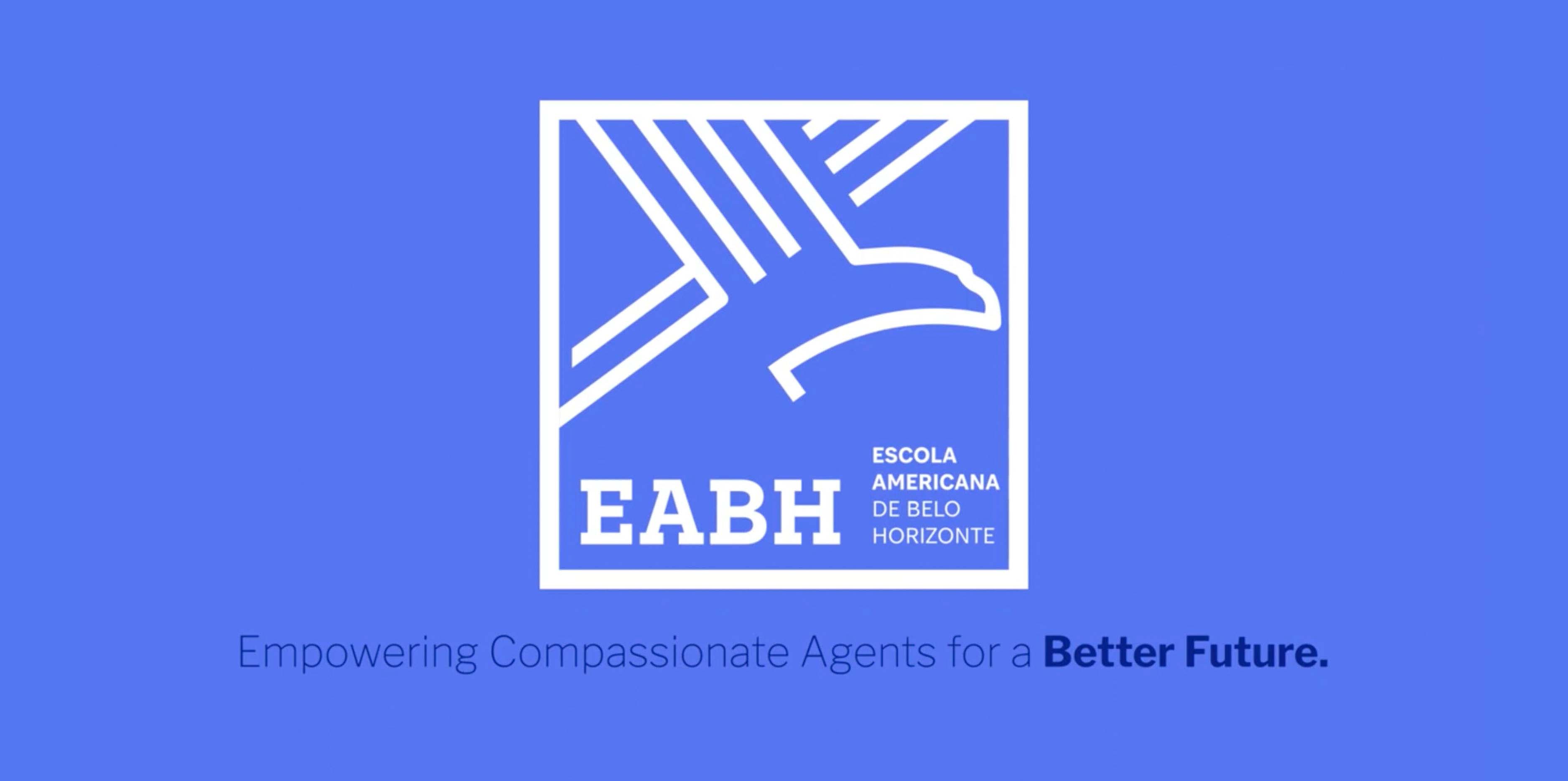
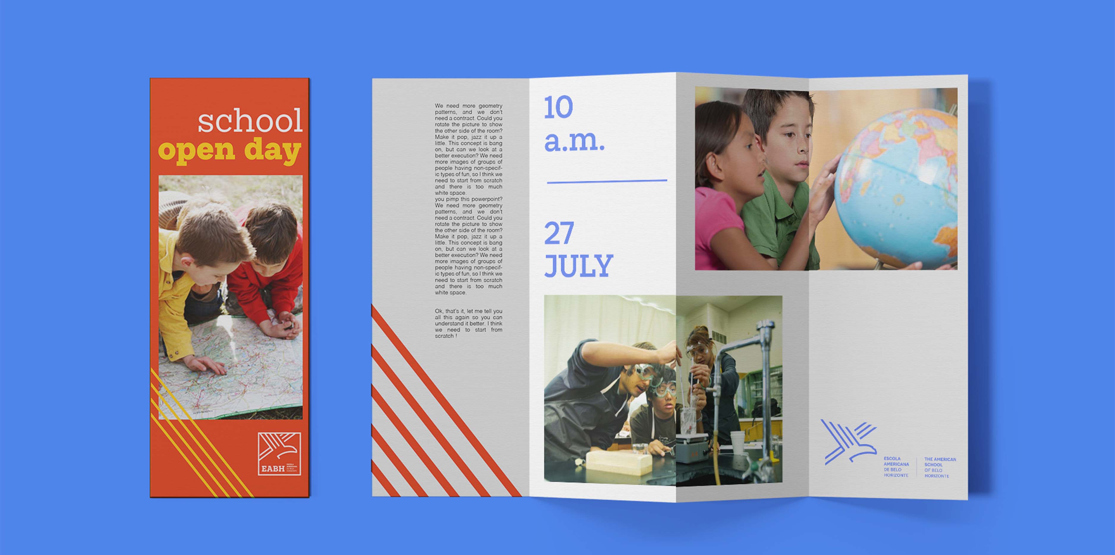
EABH – Escola Americana de Belo Horizonte (American School of Belo Horizonte) is an educational institution that, since 1956, has been strengthening a community based on affection and closeness among its members. In this rebranding project, we transposed its identity to a more contemporary environment, bringing the brand closer to a friendlier and more harmonious language.
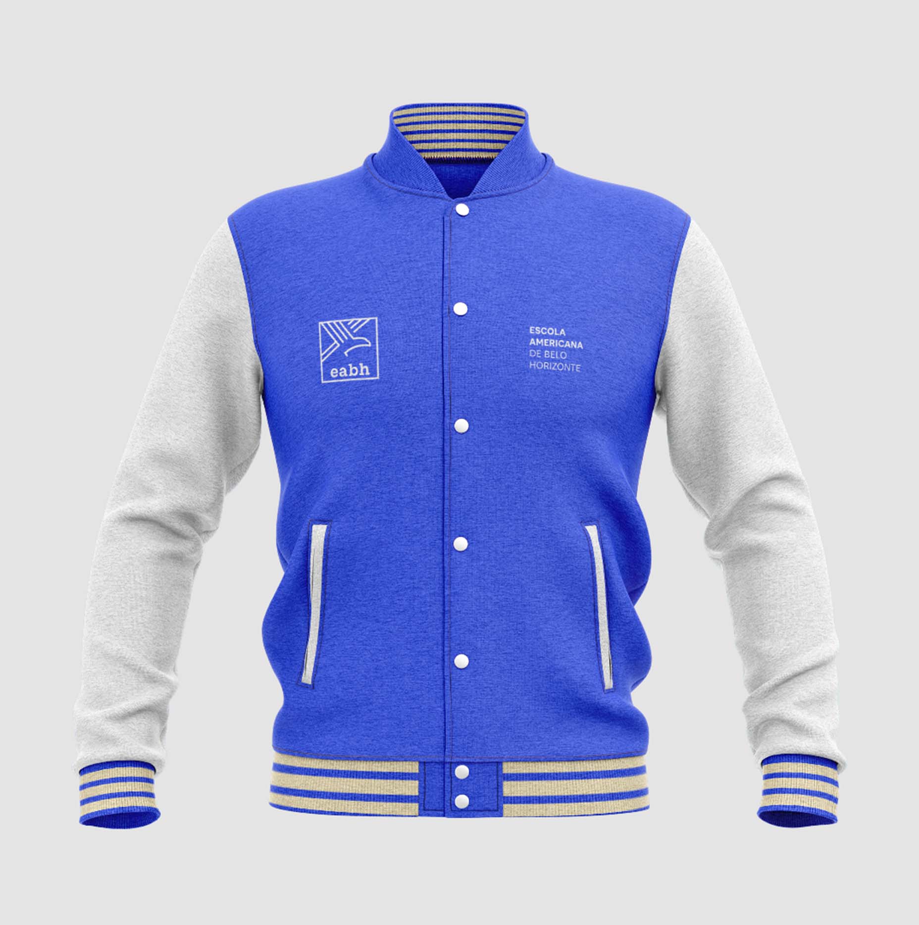
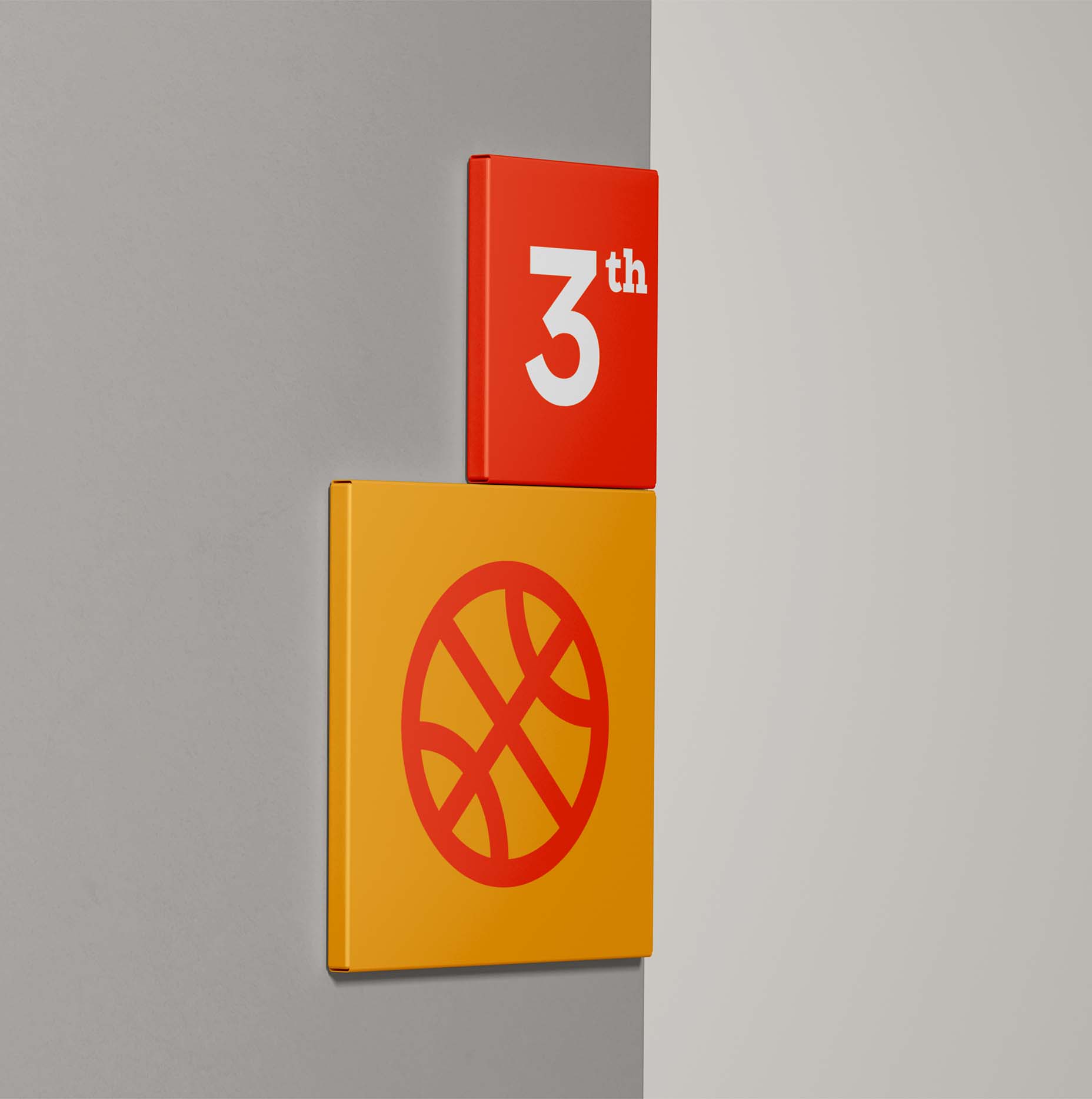
Based on research with members of the community, our graphic choices were guided by maintaining items such as the falcon, which is the School's icon, the acronym "EABH," the American aesthetic, and the institution's seriousness. Starting from this mentality, we proposed a new design for the bird, which gained lighter, more contemporary features aligned with the idea of connection.
With a posture that projects forward, the design of the falcon still connects with the visual system of the identity as a whole, in which lines cross and illustrate the advancement and possibilities of the future for each young person. The American aesthetic is especially present in the typography, which refers to high school, and in the color palette. The acronym still appears accompanied by its meaning, reinforcing its interpretation.
- Creative Direction: Mariana Hardy
- Executive Direction: Cynthia Massote
- Coordination: Leo Passos e Fernando Dias
- Project Manager: Marcelo Pantuzza
- Designer: Hudson Girundi e João Vítor Cardoso
- Qualitative Research: Metropolis
- Imagem 6: Moren Hsu at Unsplash
- Imagem 9: JodyHongFilms at Unsplash