Do Brasil


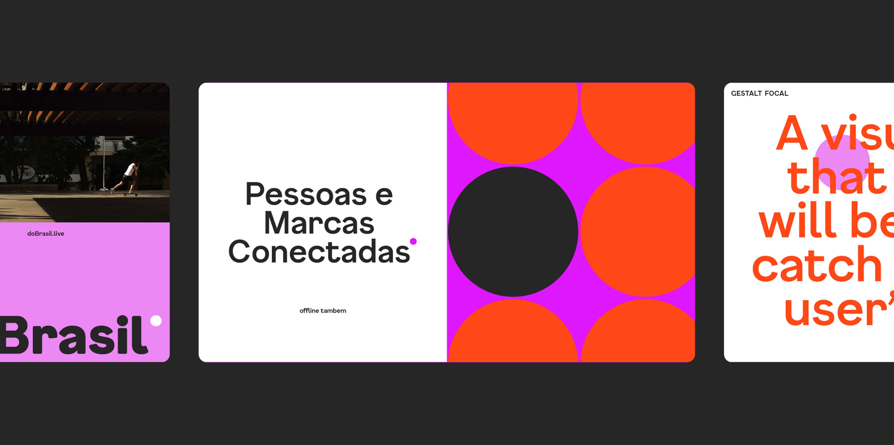


A dot as an element of connection between the physical and the digital
Do Brasil is a cultural production company with a connected, empathetic, fluid, and courageous profile. During its rebranding project, these attributes inspired us to create an accessible and hybrid language for the brand, consolidating a strong and constantly moving visual identity. Another pillar of our proposal was the feminine aspect, which dialogues with the company's leadership. To this end, we reinforced characteristics such as boldness, freshness, and dynamism.
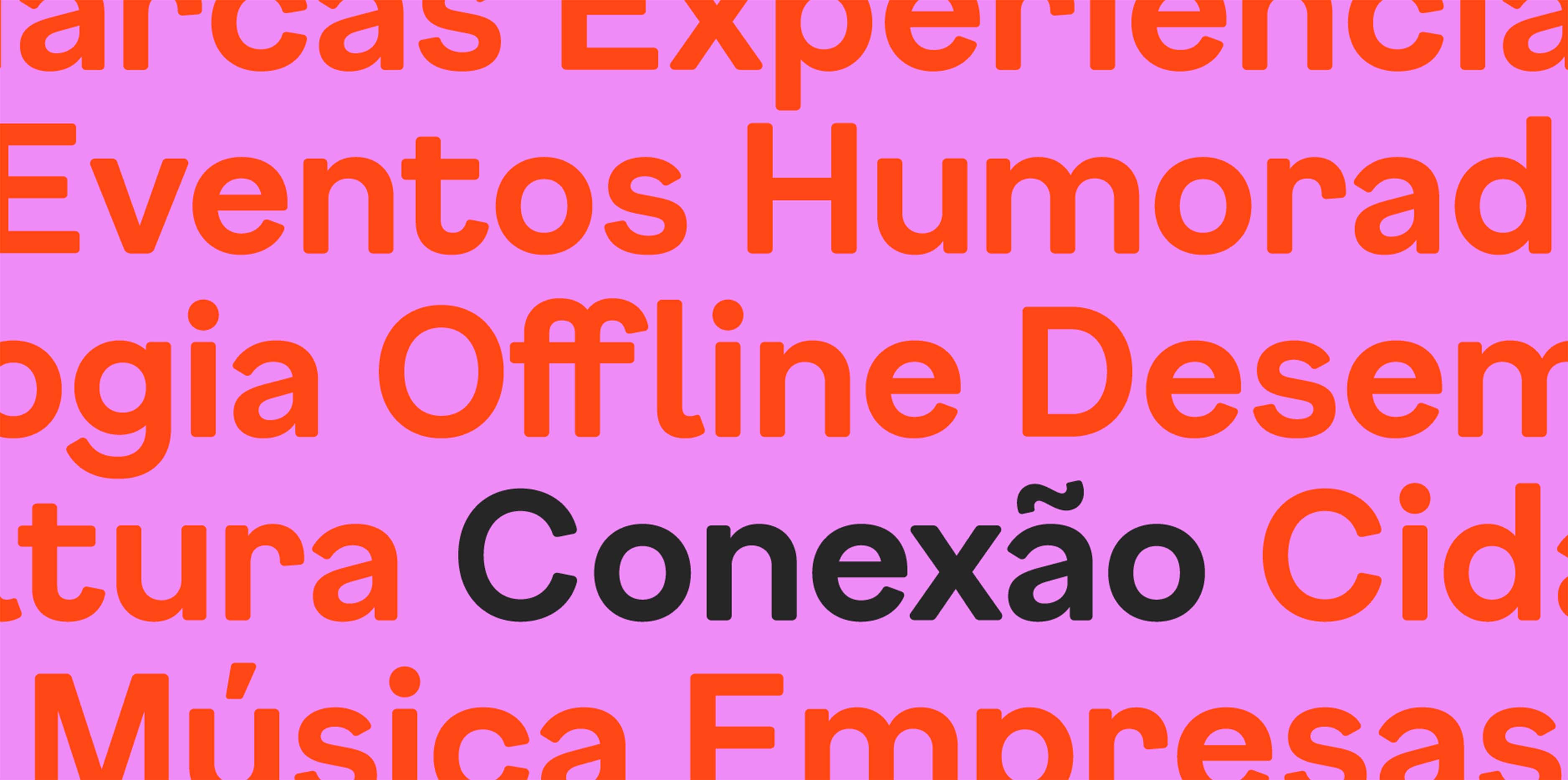
Considering Do Brasil as a meeting and connection point between people, we highlighted the dot as the main component of the identity. The point is a simple visual resource with the potential to bring the company to the center of the conversation, making the connection between the in-person and the digital. When it multiplies and repeats, its strength as a focal element expands into graphics that broaden the brand's graphic repertoire, which features a vibrant and expressive palette.
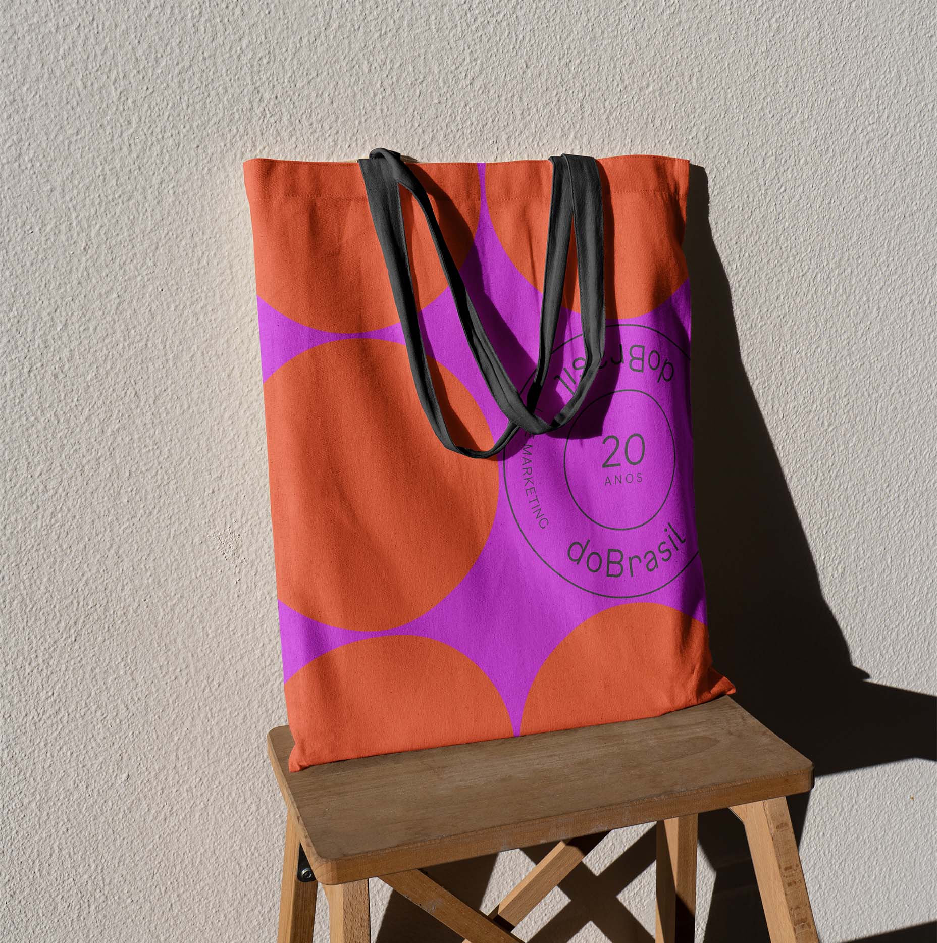
To celebrate Do Brasil's 20th anniversary, we created a seal that plays with the circular format of the dot. The seal can appear in various ways, such as in commemorative gifts or in a relaxed way among the graphics of the pieces.
- Creative Direction: Mariana Hardy
- Executive Direction: Cynthia Massote
- Creative Coordination: Fernando Dias
- Project Manager: Izabela Rodrigues
- Designer: Tobia Hallak