BDMG


Design as a link to regional development
BDMG - Banco de Desenvolvimento de Minas Gerais (Minas Gerais Development Bank) celebrated 50 years of operation by promoting a robust business repositioning, which led to a rebranding of the company. The strategic shift focused on a new audience: small business owners. To connect with this niche, the identity redesign involved research, workshops, and a long maturation process with the client's team.
The resulting graphic design celebrates the bank's partnership with small entrepreneurs. The brand icon depicts a double-sided ribbon in the shape of an arrow, pointing towards the future. The blank space of the icon references the triangle from the Minas Gerais flag, and its outer structure forms a capital D, semiotically linking the bank to the state's development.
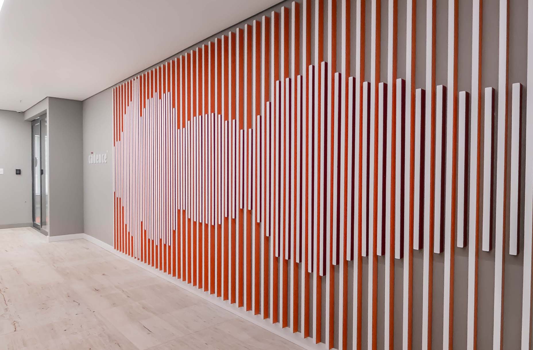
This project includes a brand book and the signage and visual communication for the headquarters building, which explores the triangle iconography in various forms. Additionally, we developed the identity for BDMG Cultural, the institution's arm that fosters and promotes diverse cultural projects. These pieces have more flexibility and breadth in the possibilities of graphics, illustrations, and colors.
- Creative Direction: Mariana Hardy
- Executive Direction: Cynthia Massote
- Project Manager: Marcela Dantés
- Designer: Débora Cruz, Gustavo Magno, Mônica Fernadino e Renata Polastri
- Graphic Production: Mirelle Bairral e Gustavo Magno
- Photography: Marcelo Coelho e Gustavo Magno