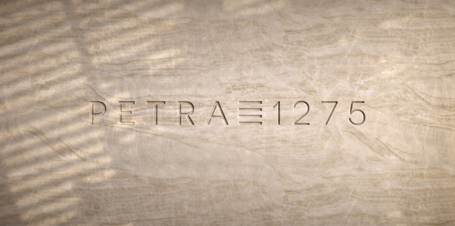
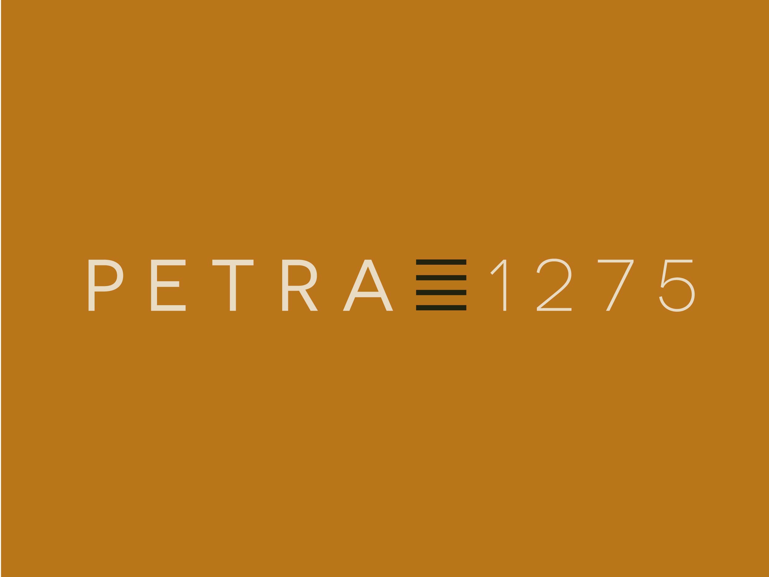
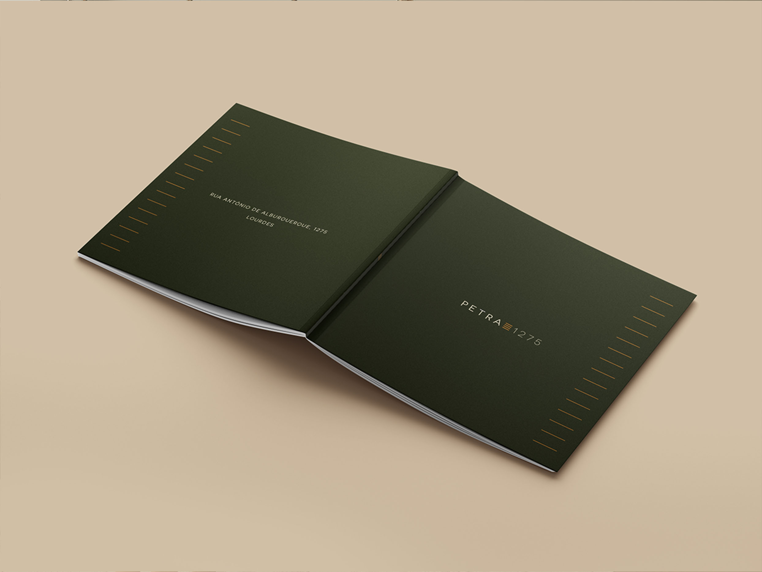
Petra 1275


The solid and the natural in a high-standard living
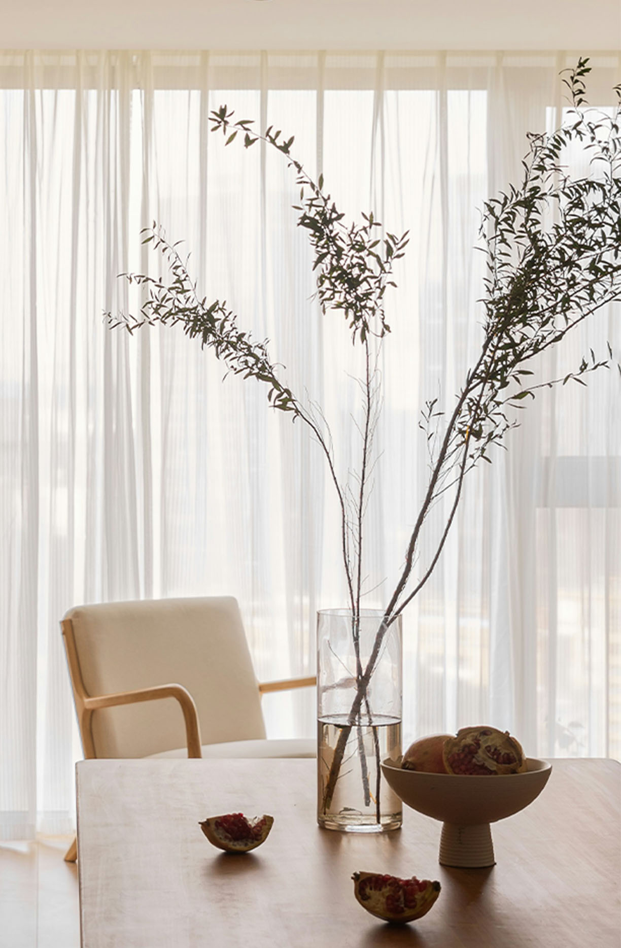
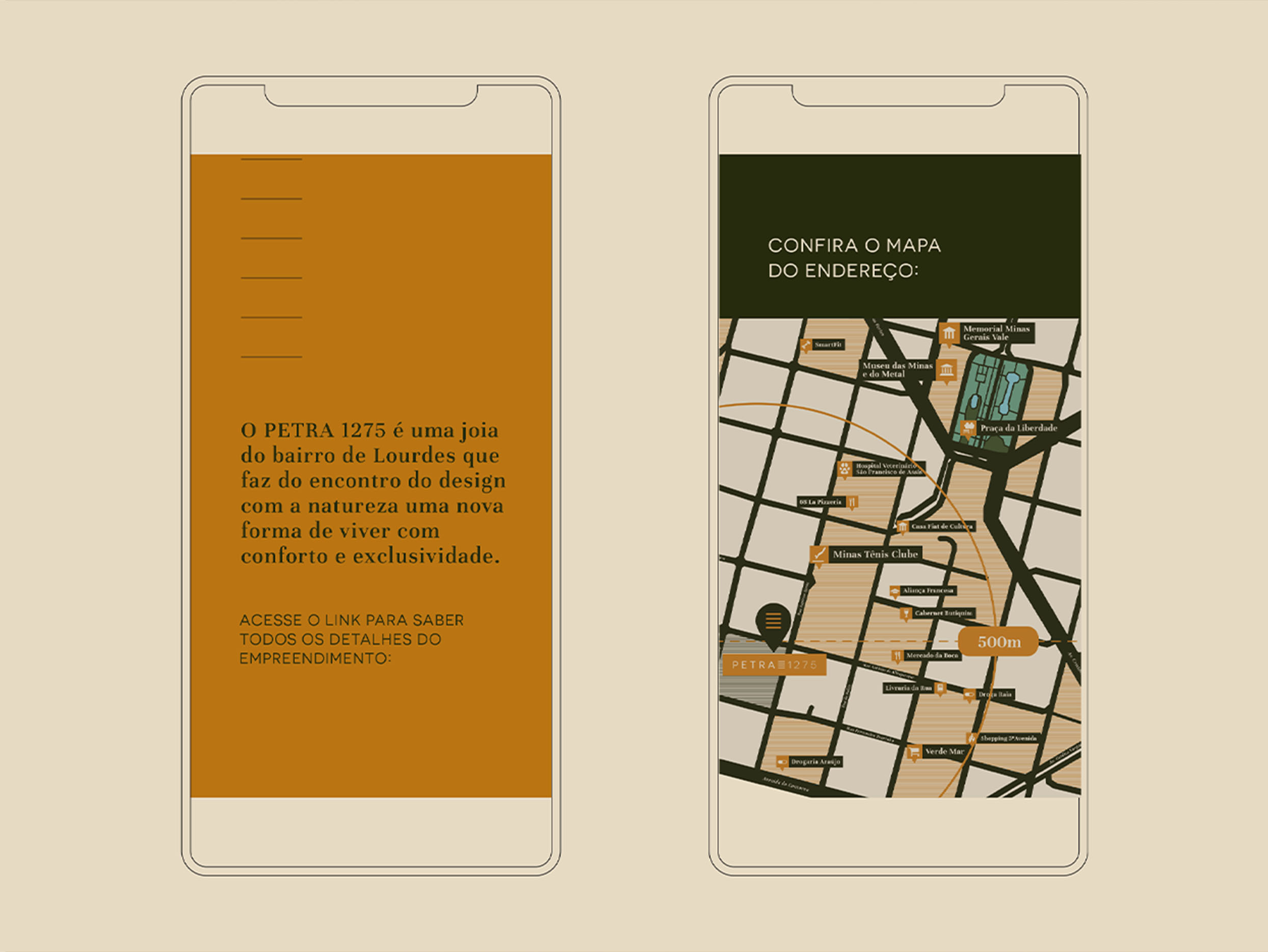
For the new high-end real estate development by Trena Construtora in partnership with Pentagna Incorporadora in Belo Horizonte, our job was to create a brand that referred to slow living and living with comfort and exclusivity.
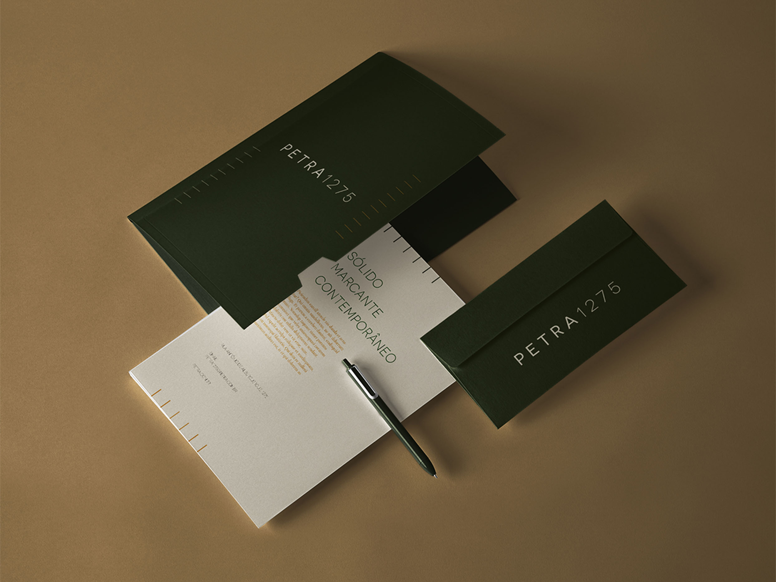
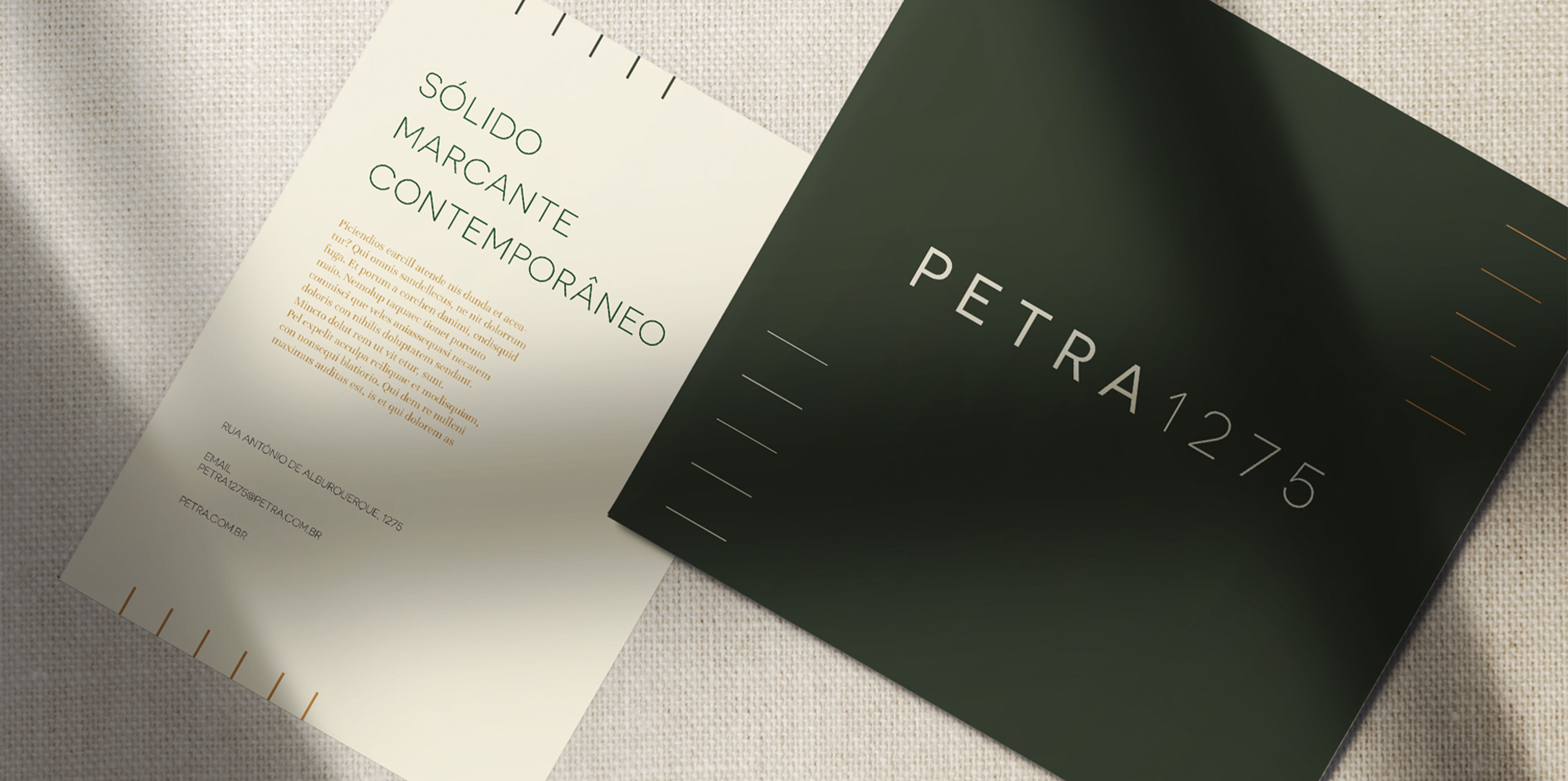
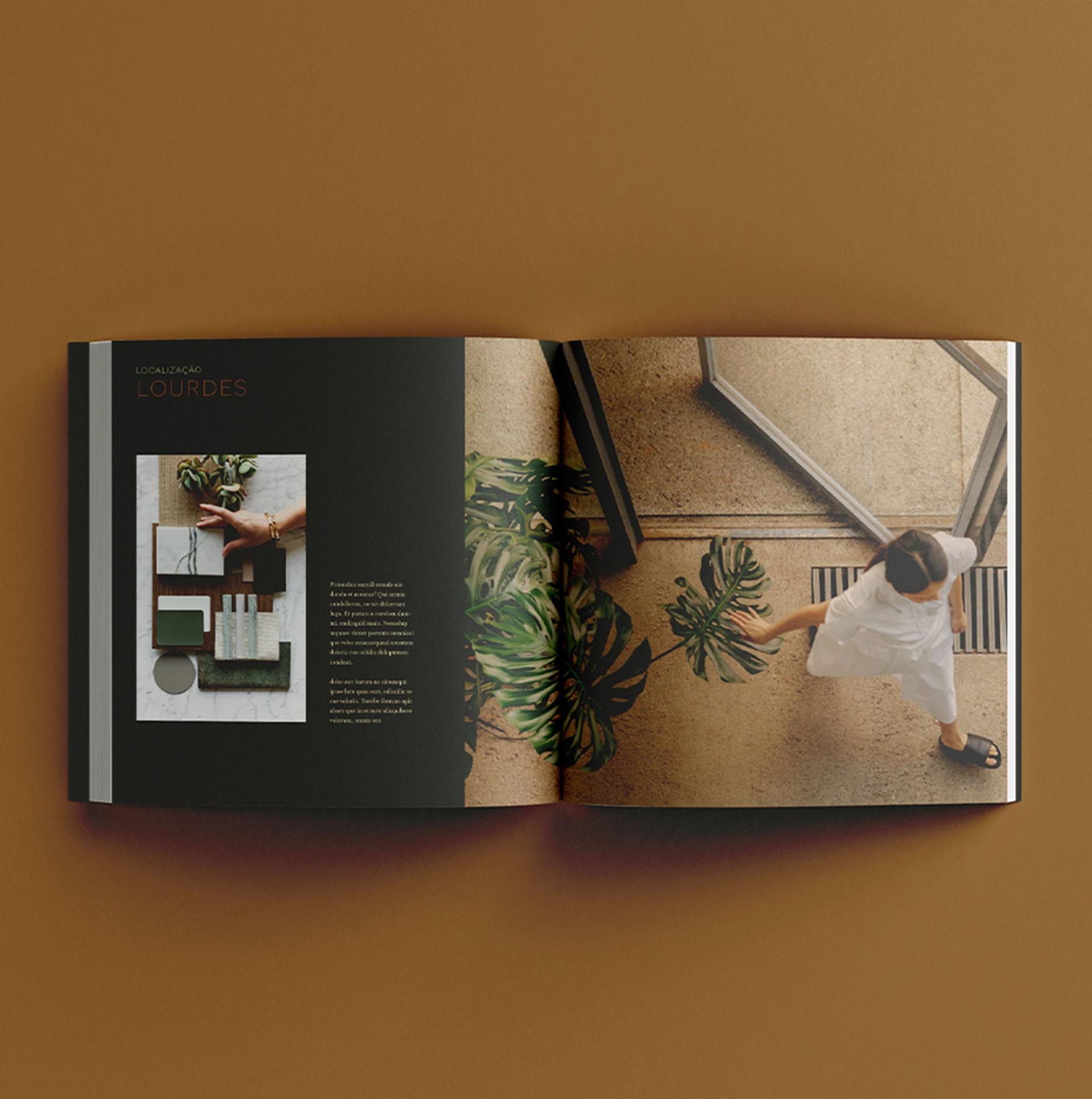
Starting with the naming, we proposed to evoke the distinction and welcoming of the natural materials of the new building's project. To this end, we chose the name "Petra," which refers to the historic city known for its architecture carved in rock. For the development's visual identity, we selected the Novecento Sans Wide family as the main typography, which is based on regular geometric designs and is presented only in uppercase.
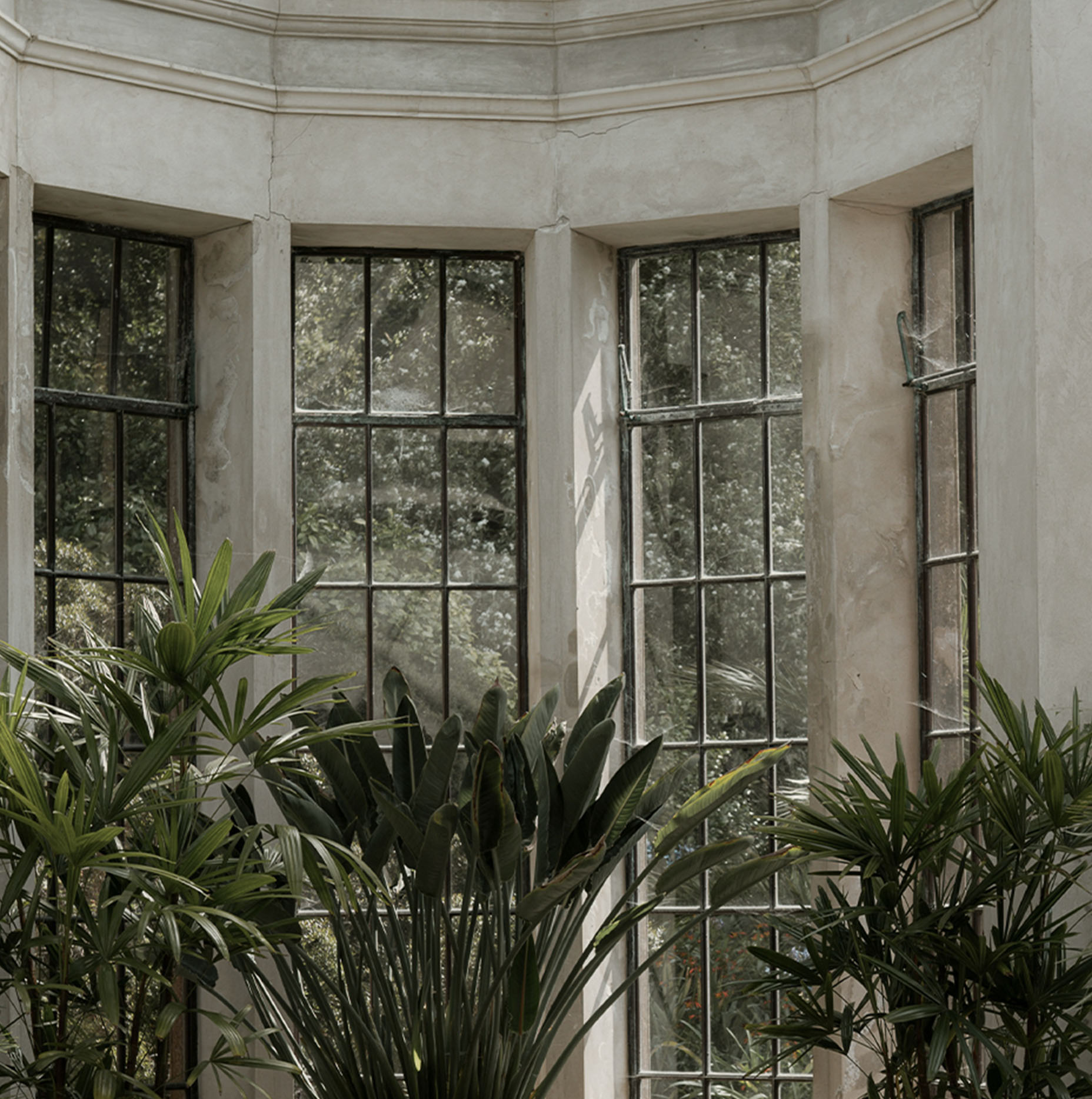
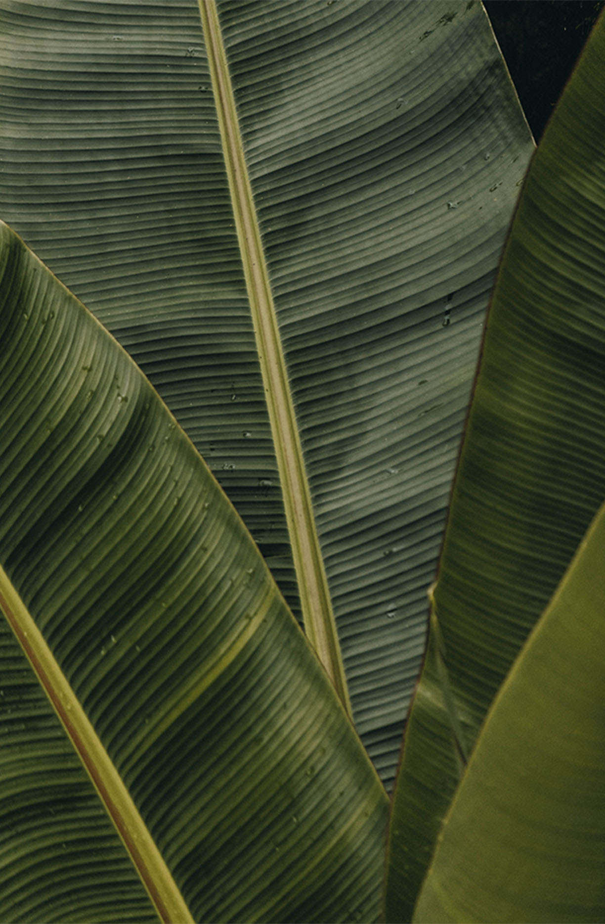
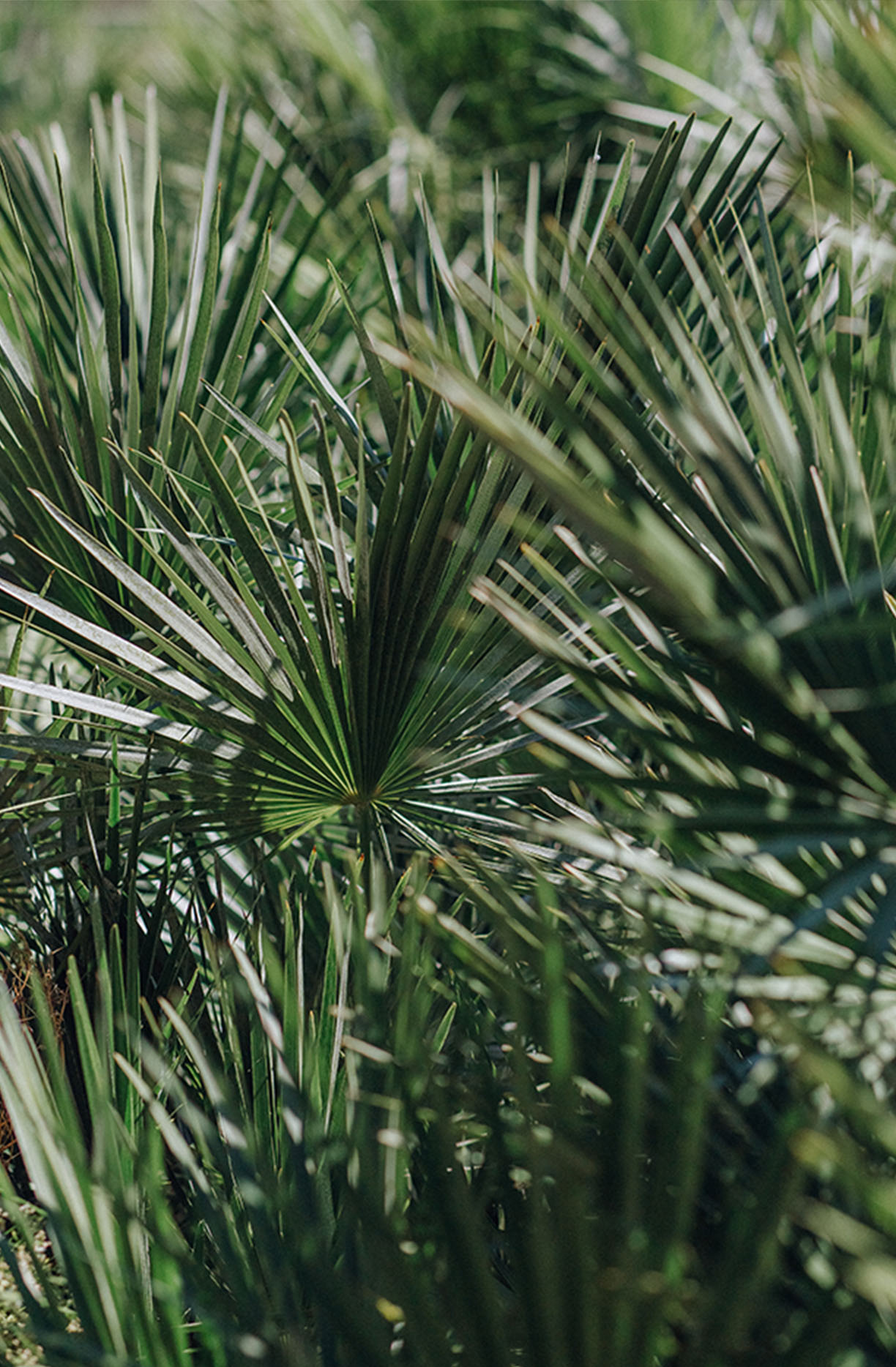
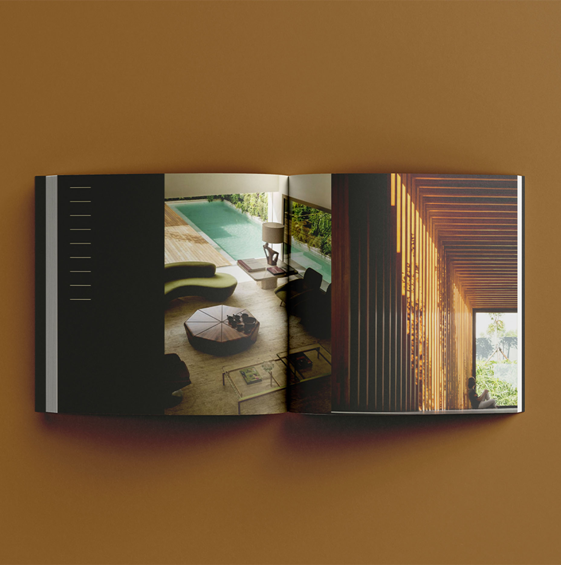
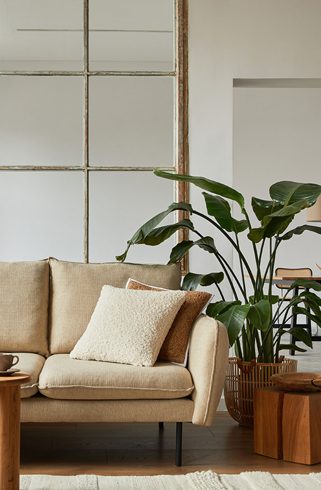
The colors chosen for the project are close to the tones of the noble materials present in the building, harmonizing with the landscaping. They are woody, caramel, chestnut, beige, green, and gray tones. To reinforce the dialogue of the visual identity with the building, we designed graphics inspired by the project's brises-soleils and Trespa wood. The building's identity was also used on the development's website, whose layout and content are signed by Hardy.
- Creative Direction: Mariana Hardy
- Executive Direction and Naming: Cynthia Massote
- Creative Coordination: Leo Passos
- Designer: Rafael Simões
- Project Manager: Beatriz Fonseca
- Graphic Production: Daniele Pires