Brazilian Nickel


From extraction to process intelligence, a new brand language
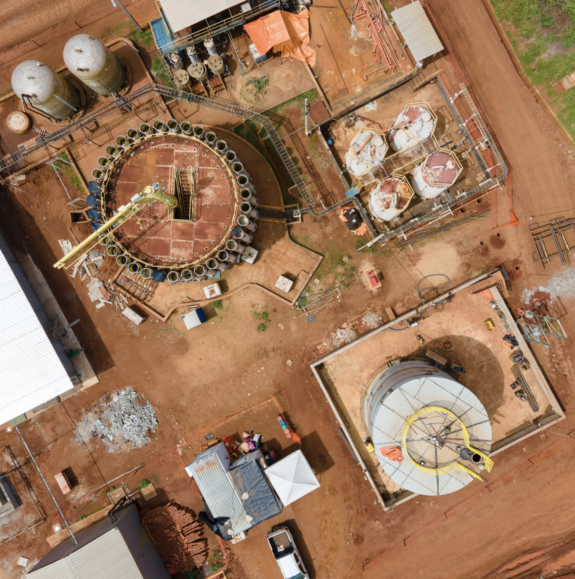
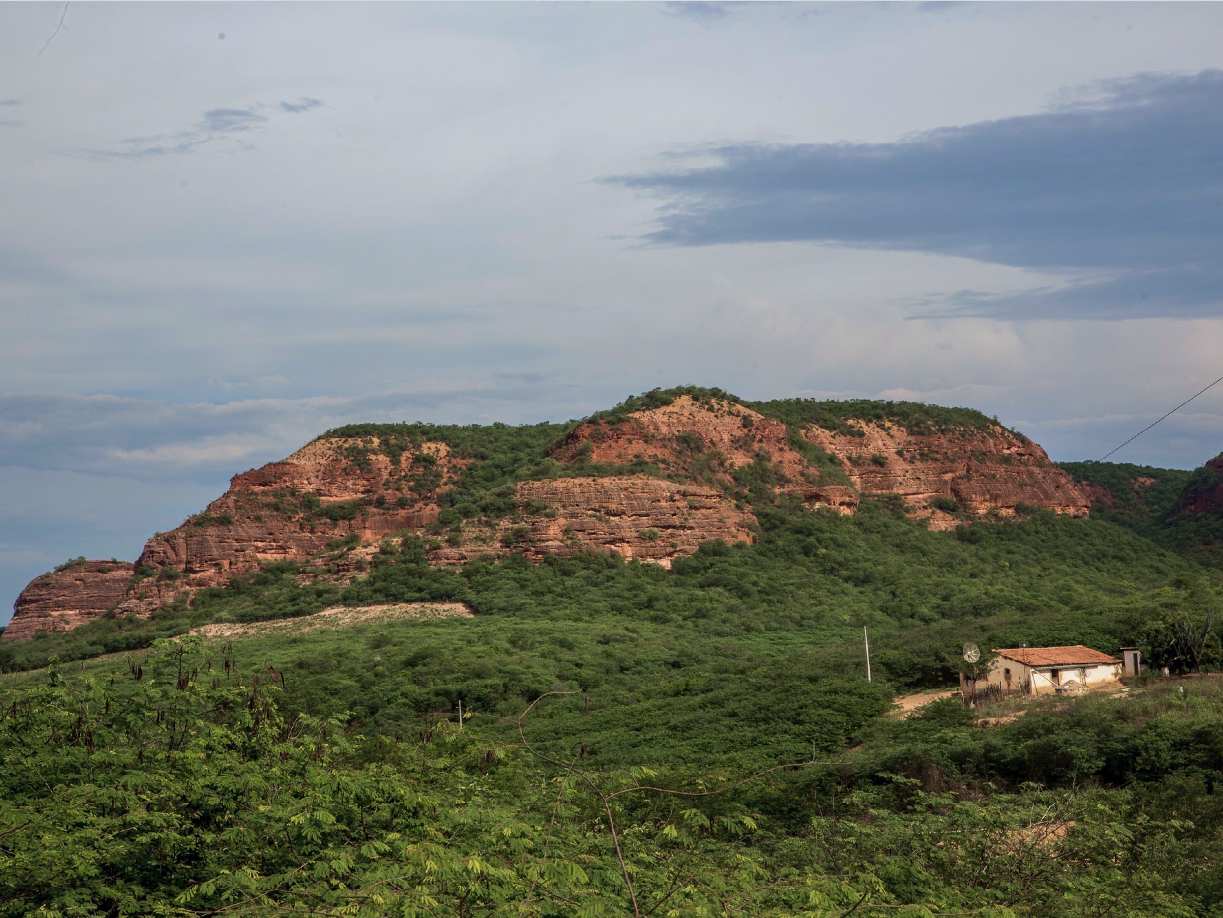
Brazilian Nickel is a company dedicated to the sustainable development of nickel and cobalt projects in Brazil, playing a strategic role in the global critical minerals supply chain. Our rebranding work originated from a moment of transition for the company, which demanded a more mature, international language capable of reflecting not only mining, but the intelligence of its processes and its contribution to the energy transition.
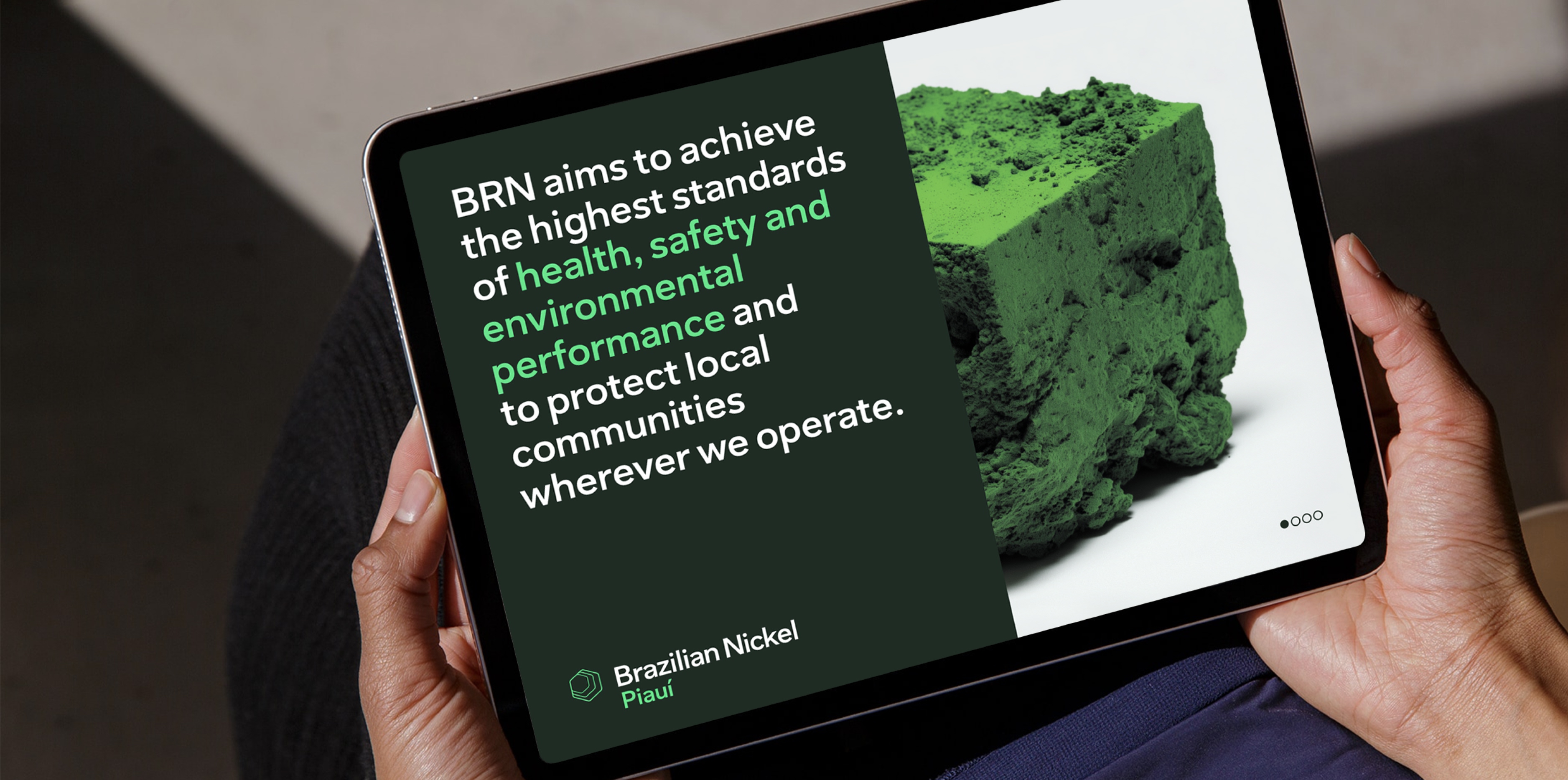
Based on the concept “Technology and Nature,” we structured an identity that shifts the focus from extraction to transformation. The brand now communicates the conversion of raw materials into technological value, highlighting the balance between industrial precision and environmental responsibility. This direction guides the entire visual system, which seeks to translate the company's operations in a clear, contemporary, and consistent manner.
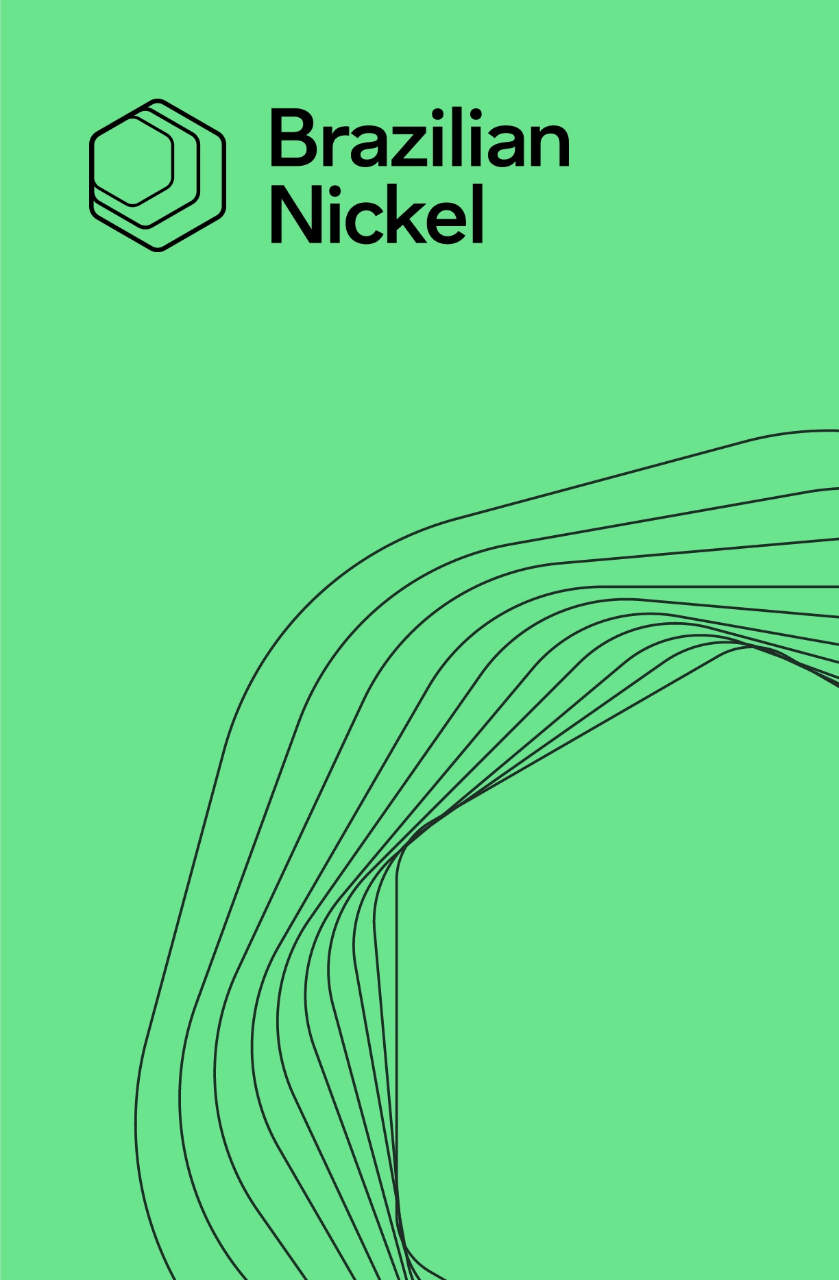
The symbol was developed based on references to the crystalline structure of nickel, organized in hexagonal patterns that evoke balance, efficiency, and interconnection. Its construction combines geometry and fluidity, creating layers that evoke both industrial processes and the transformation of matter into a high-tech element. The rounded corners soften the rigidity of the shape, reinforcing an identity that is precise, yet open and contemporary.
This principle unfolds across the entire system, from typography to the color palette, ensuring consistency and adaptability in different contexts—from operational environments to global corporate communications. More than a new identity, the project establishes a language capable of sustaining Brazilian Nickel's evolution as a relevant player in building a low-carbon future.
- Creative Direction: Mariana Hardy
- Executive Direction: Cynthia Massote
- Creative Coordination: Pedro de Albergaria
- Project Manager: Thiago Santos e Joana Moretzsohn
- Copywriting: Clara Barbi
- Design: Maíra Martines, Thiago Guerreiro