BH Airport


Expanding the possibilities of a hub in the heart of Brazil
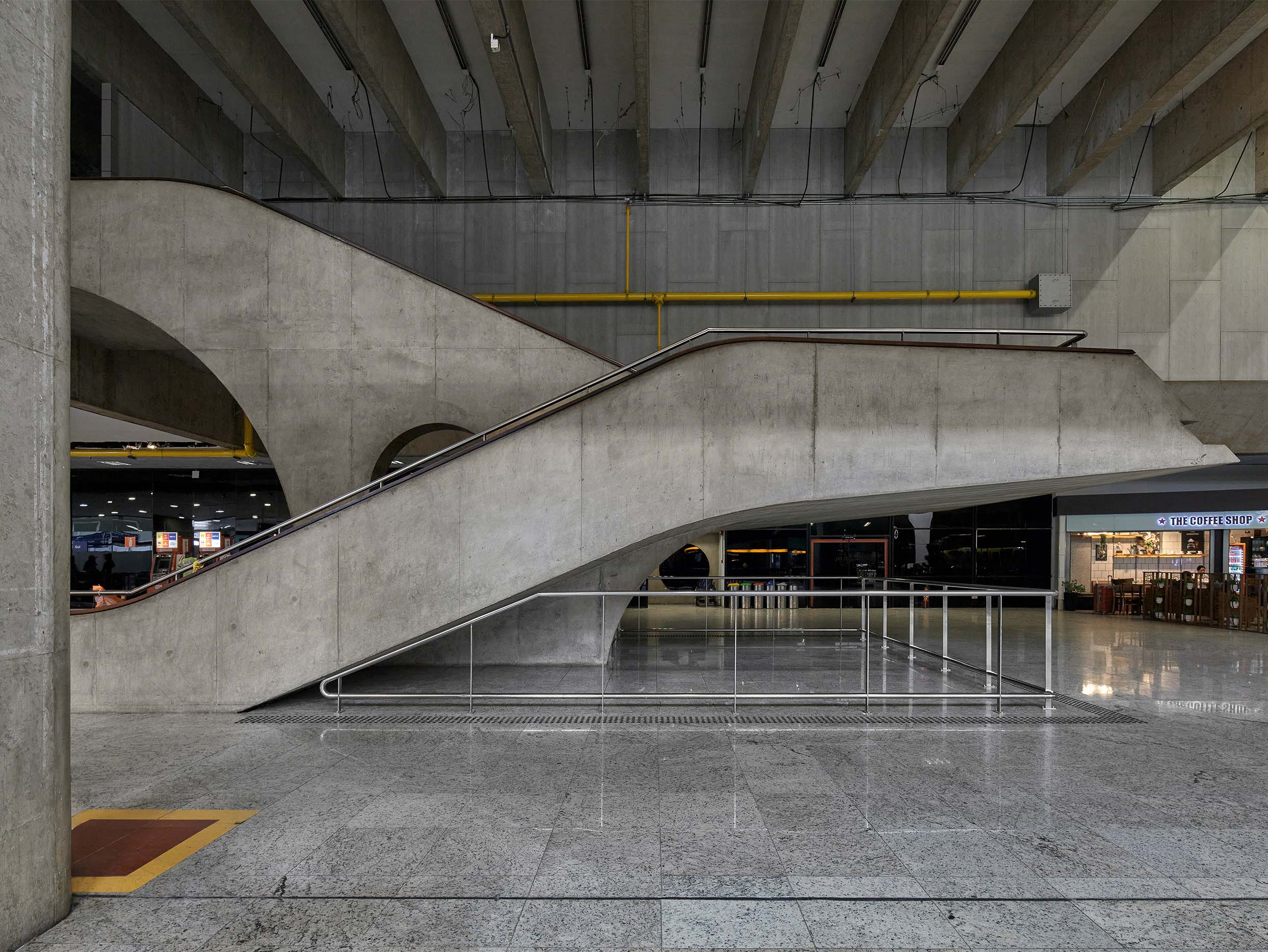
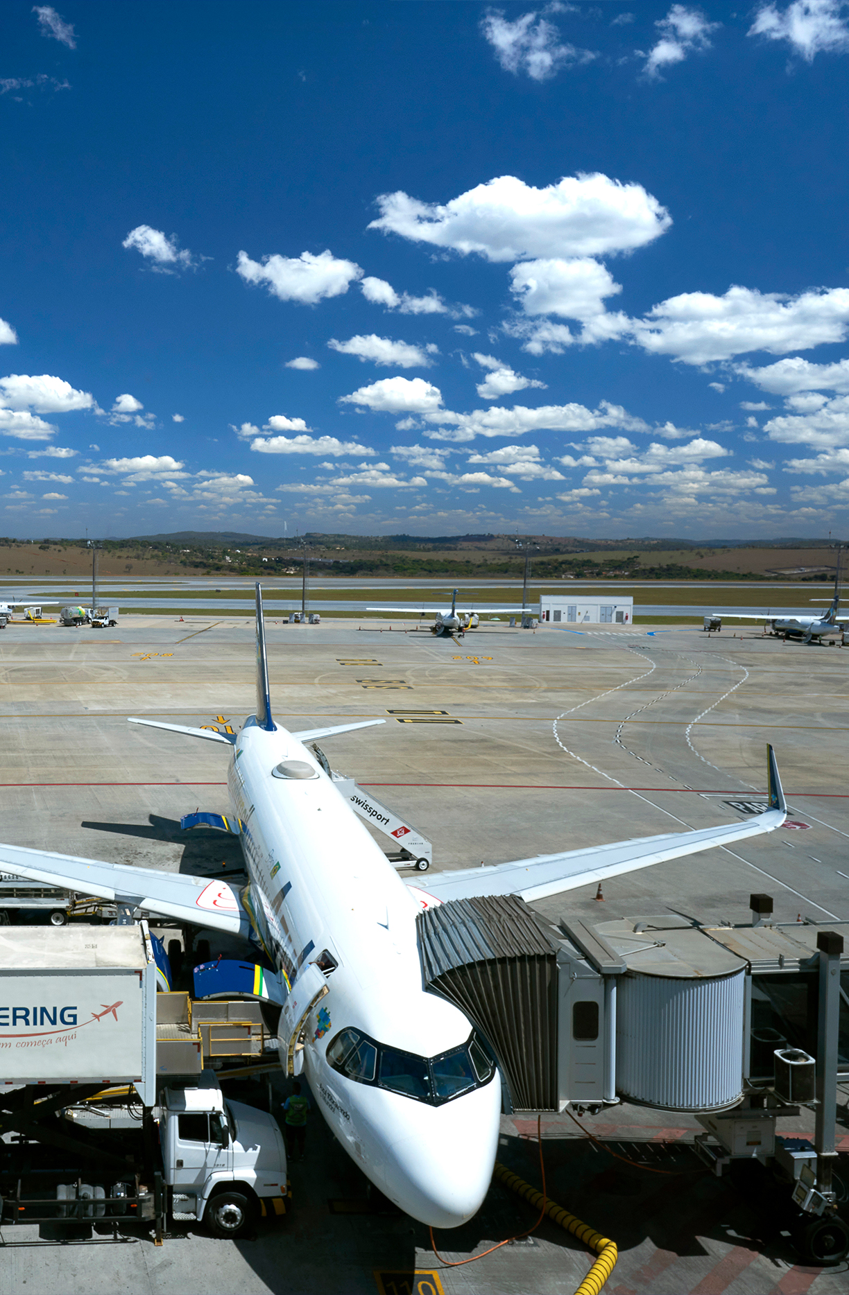
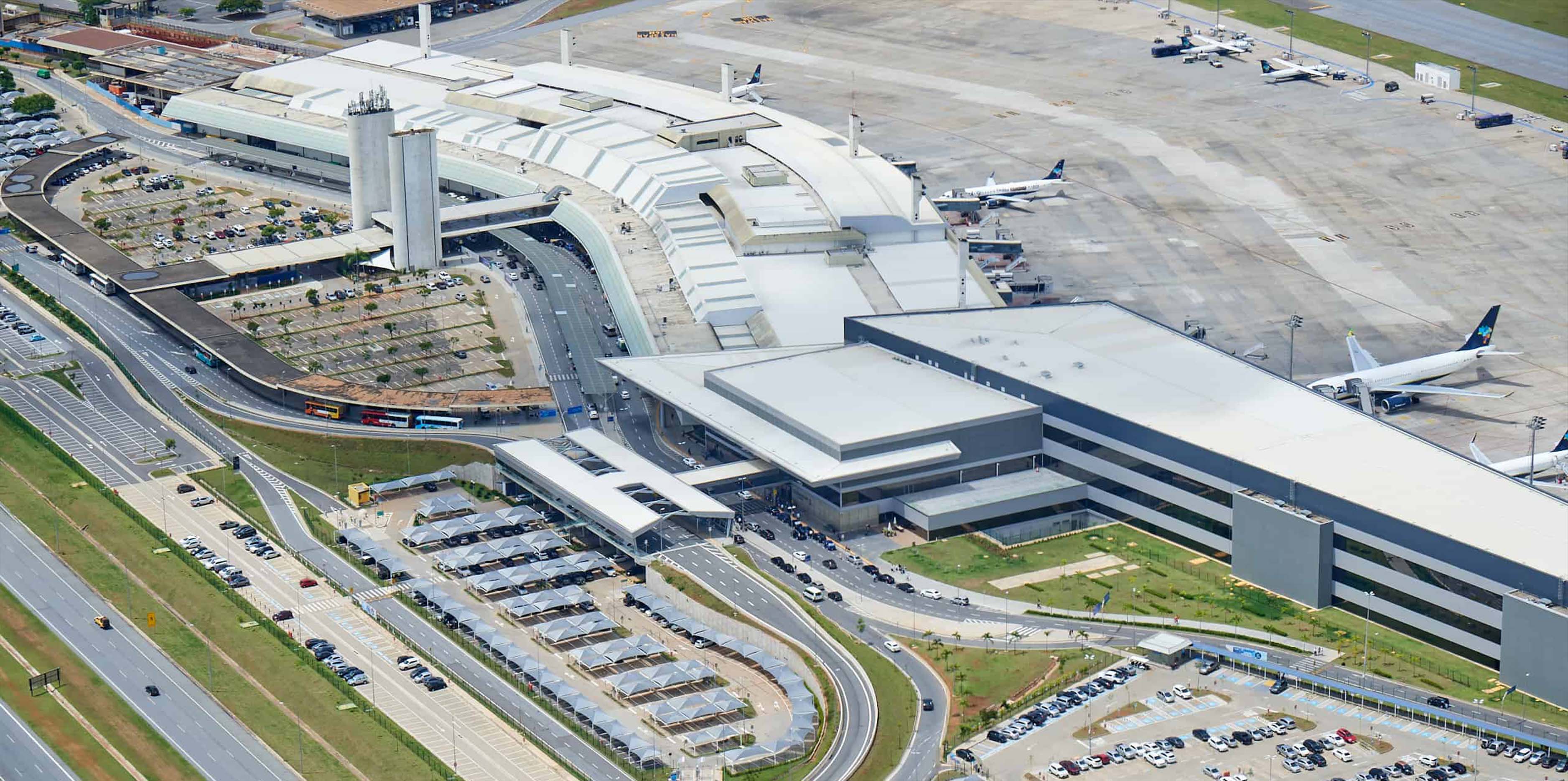
Just like the company that manages it, BH Airport is the name of Belo Horizonte International Airport, located in Confins, which is now positioning itself as a major logistics hub. To contribute to this new phase, bringing the brand closer to people and generating a sense of pride in employees and the airport community, we developed a rebranding project that included creating a new visual identity for the company and a new signage system.
Based on values such as the essence of Minas Gerais, pioneering spirit, safety, and practicality, we created an icon composed of two shapes that describe both the precise movement of aircraft and the connection of people and destinations, as well as the convergence of opportunities. Blue, predominant in the previous brand, remained the main color of the identity. This time, it is accompanied by orange, which refers to the region of Minas Gerais.
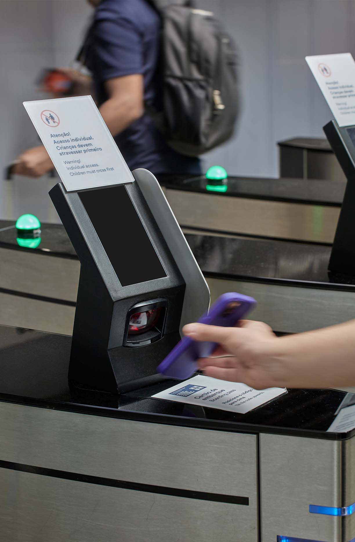
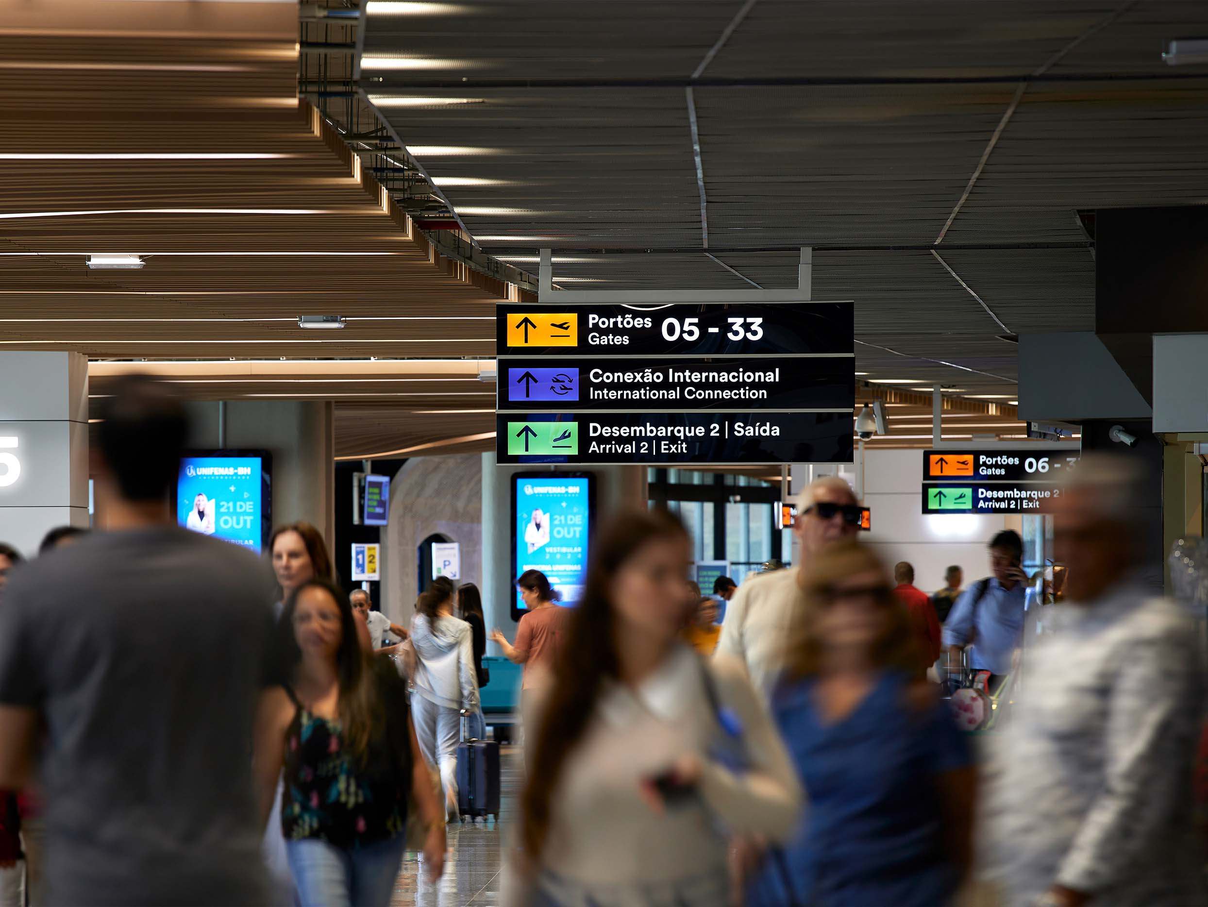
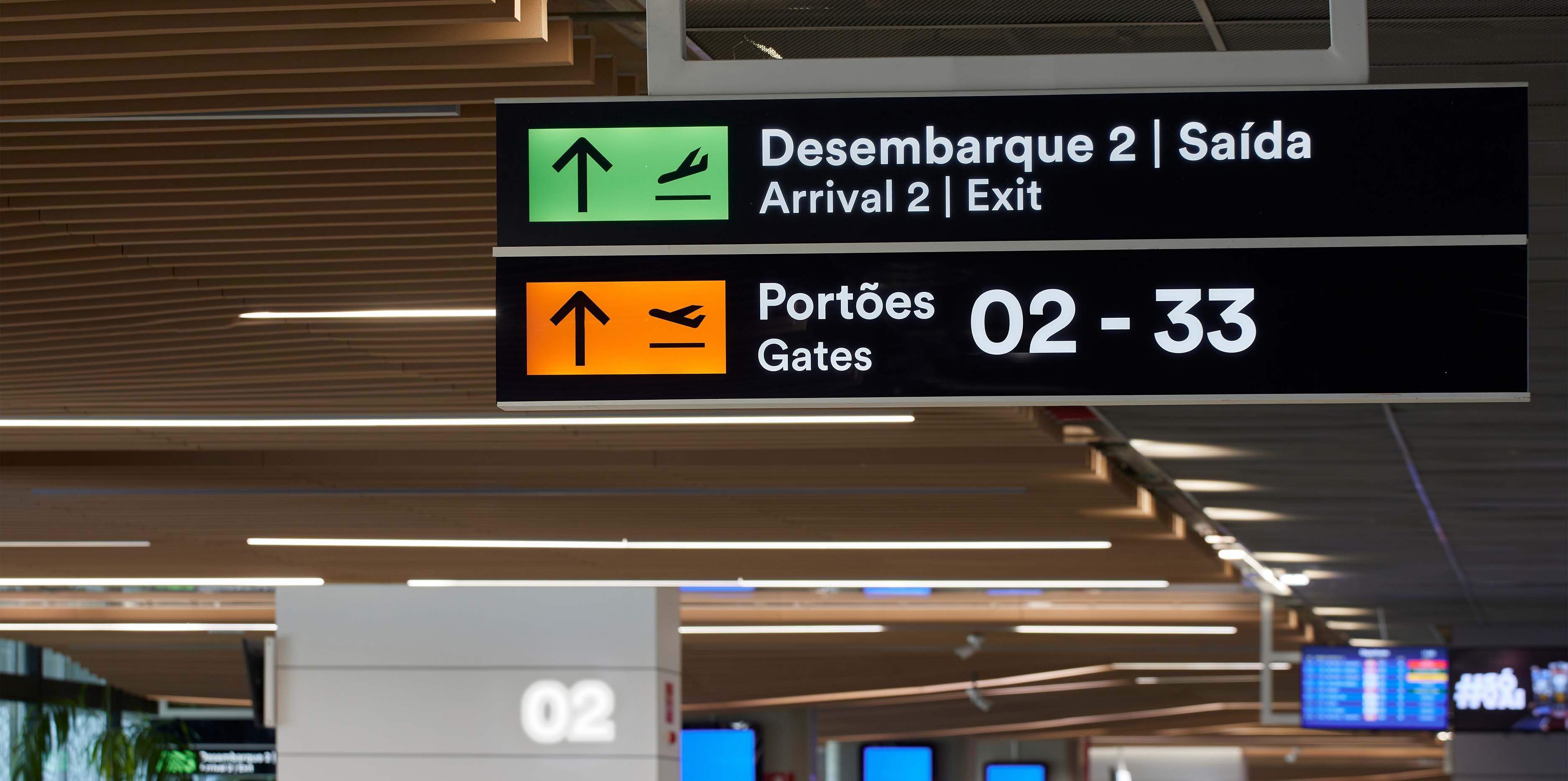
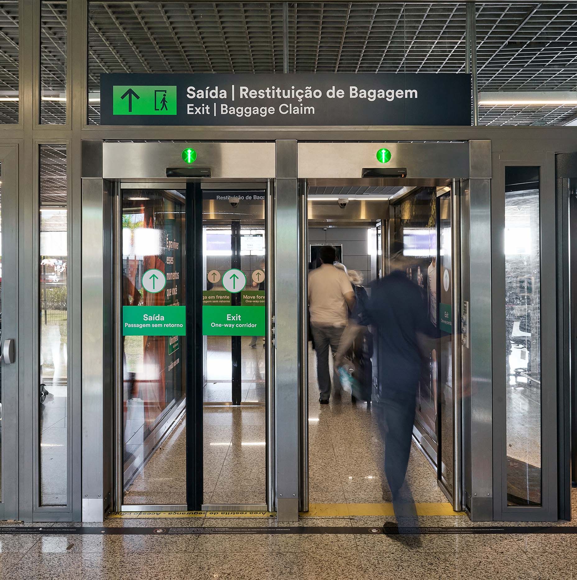
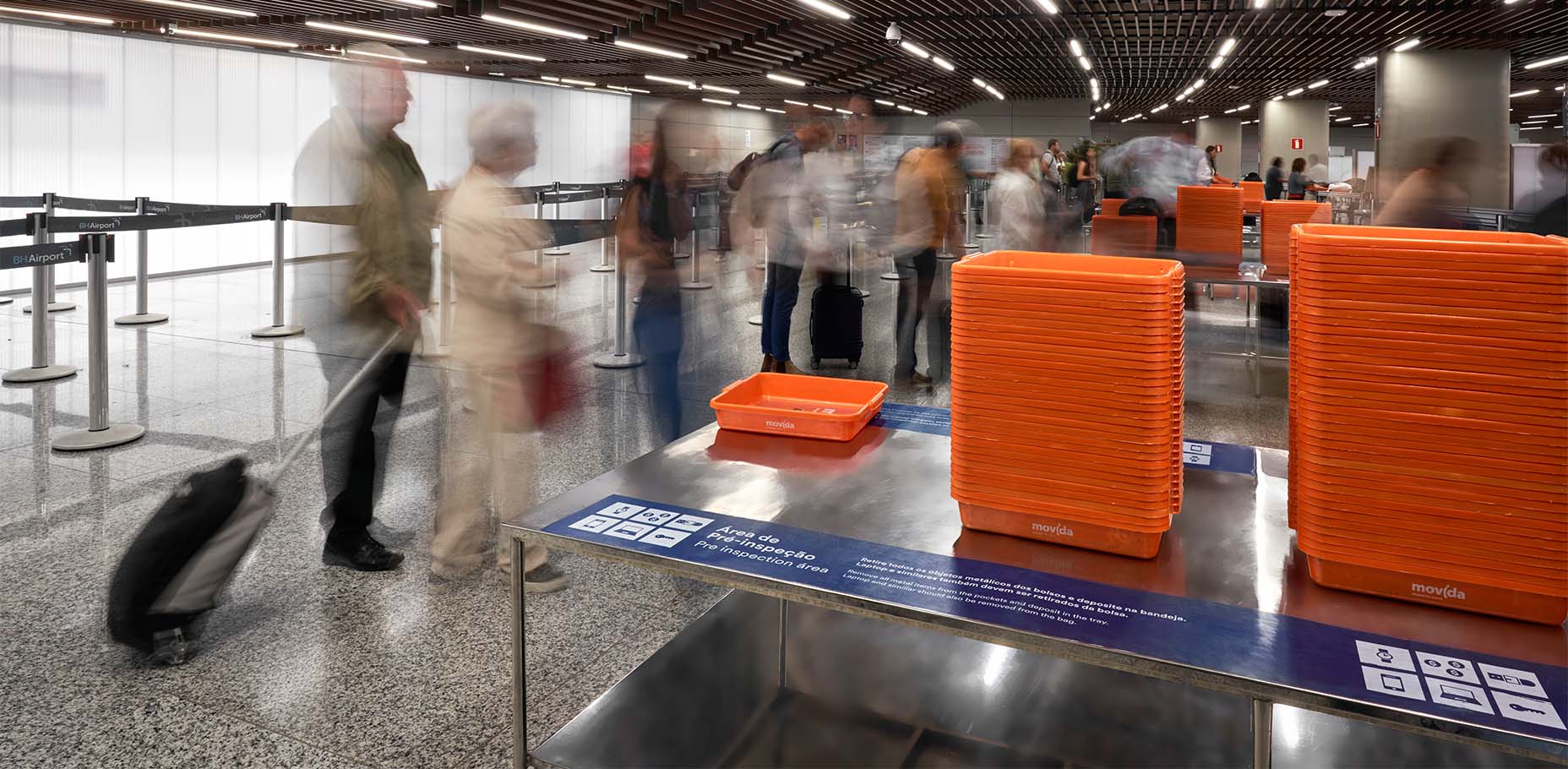
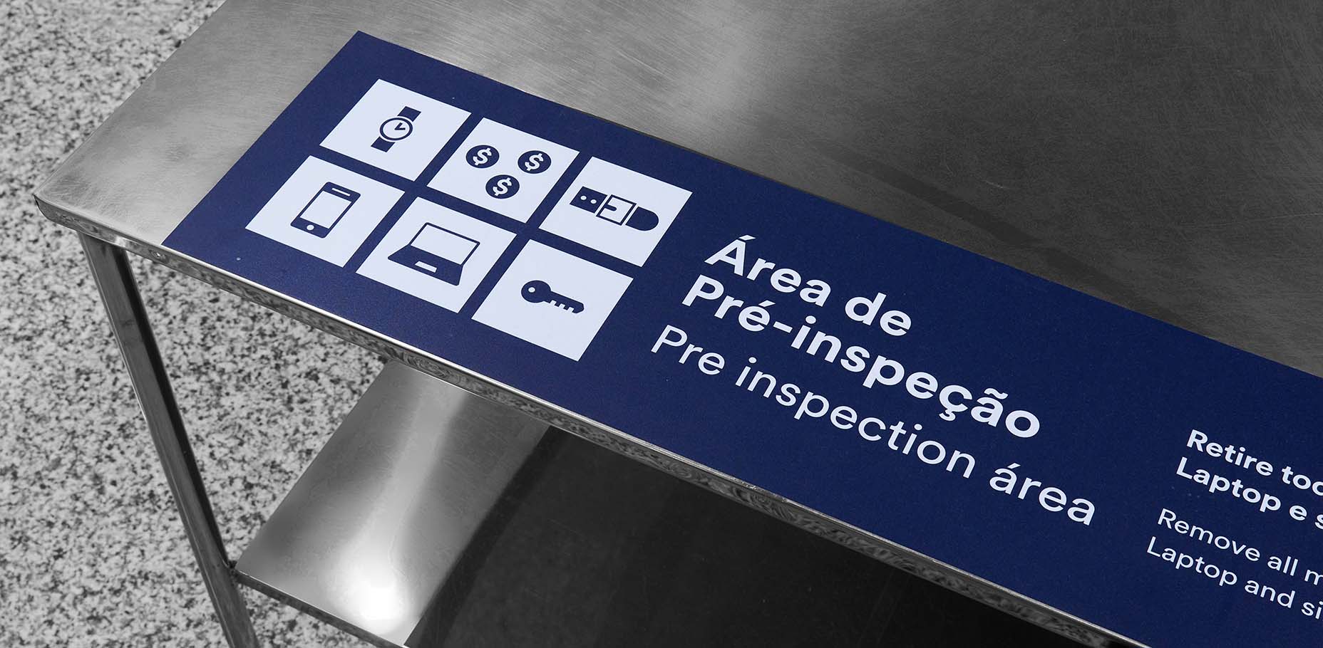
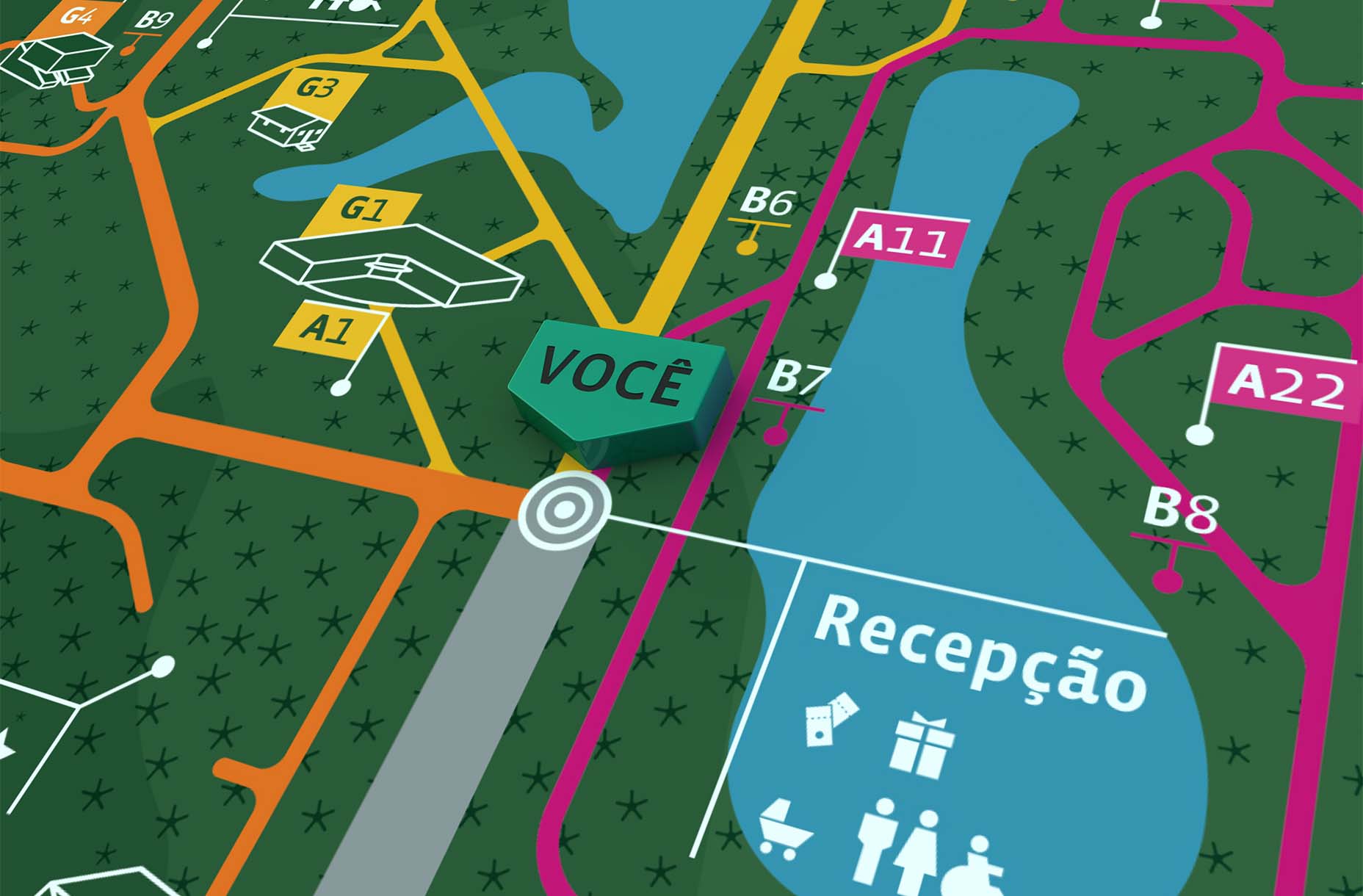
In addition to developing a sub-brand for BH Airport's cargo service, we also proposed a new signage system for terminals and parking lots. Taking into account minimal intervention in the current structure of the pieces, we organized the information and the grid of the panels, proposing changes in colors, typography, and pictograms to organize flows and allow for smooth and clear transit for passengers and users, as well as to prepare the airport for the possibilities that will come from the company's new positioning.
- Creative Direction: Mariana Hardy
- Executive Direction: Cynthia Massote
- Creative Coordination Leo Passos (Branding) e Pedro de Albergaria (Sinalização)
- Project Maneger: Beatriz Fonseca (Branding) e Marcelo Pantuzza (Sinalização)
- Designer: João Vitor Cardoso (Branding), Rafael Sola e Tetê Gontijo (Sinalização)
- Produção gráfica: Daniele Pires