Doiz


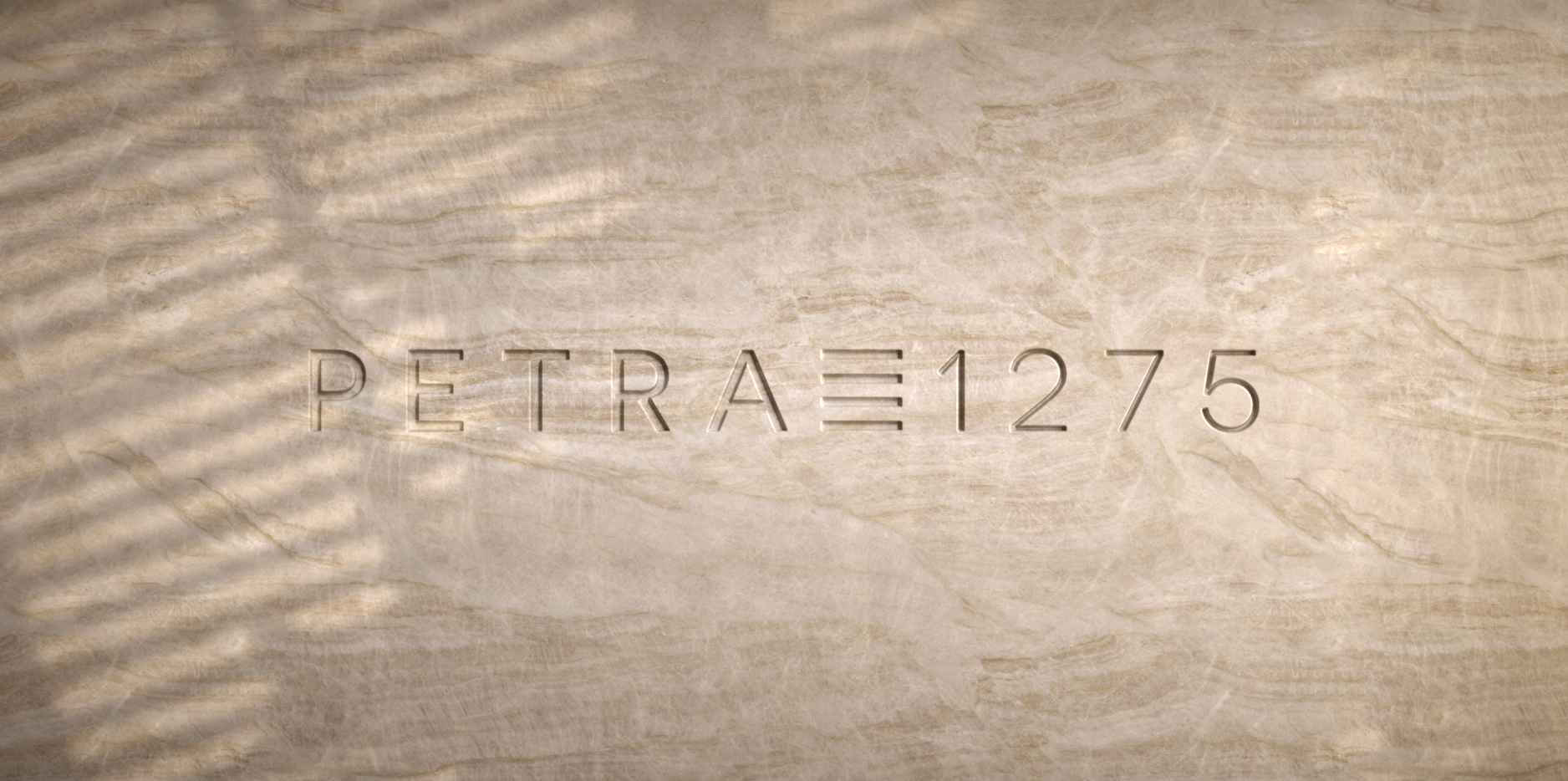


Equilibrando o dual e o complementar em um serviço de lazer
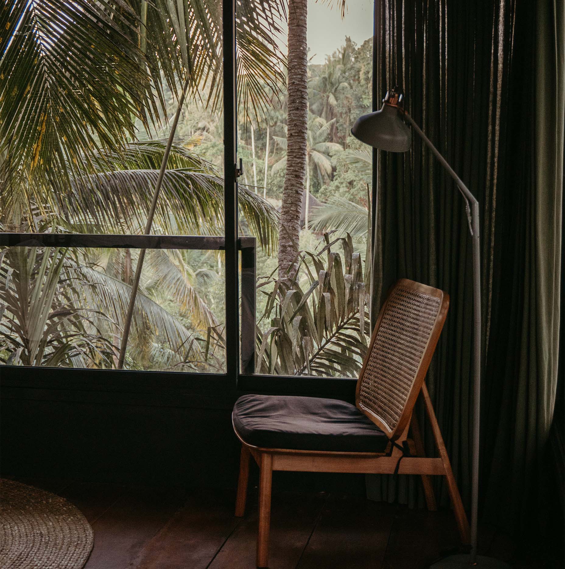
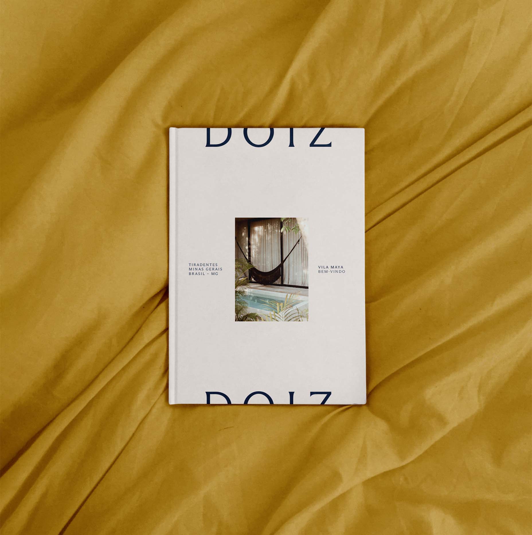
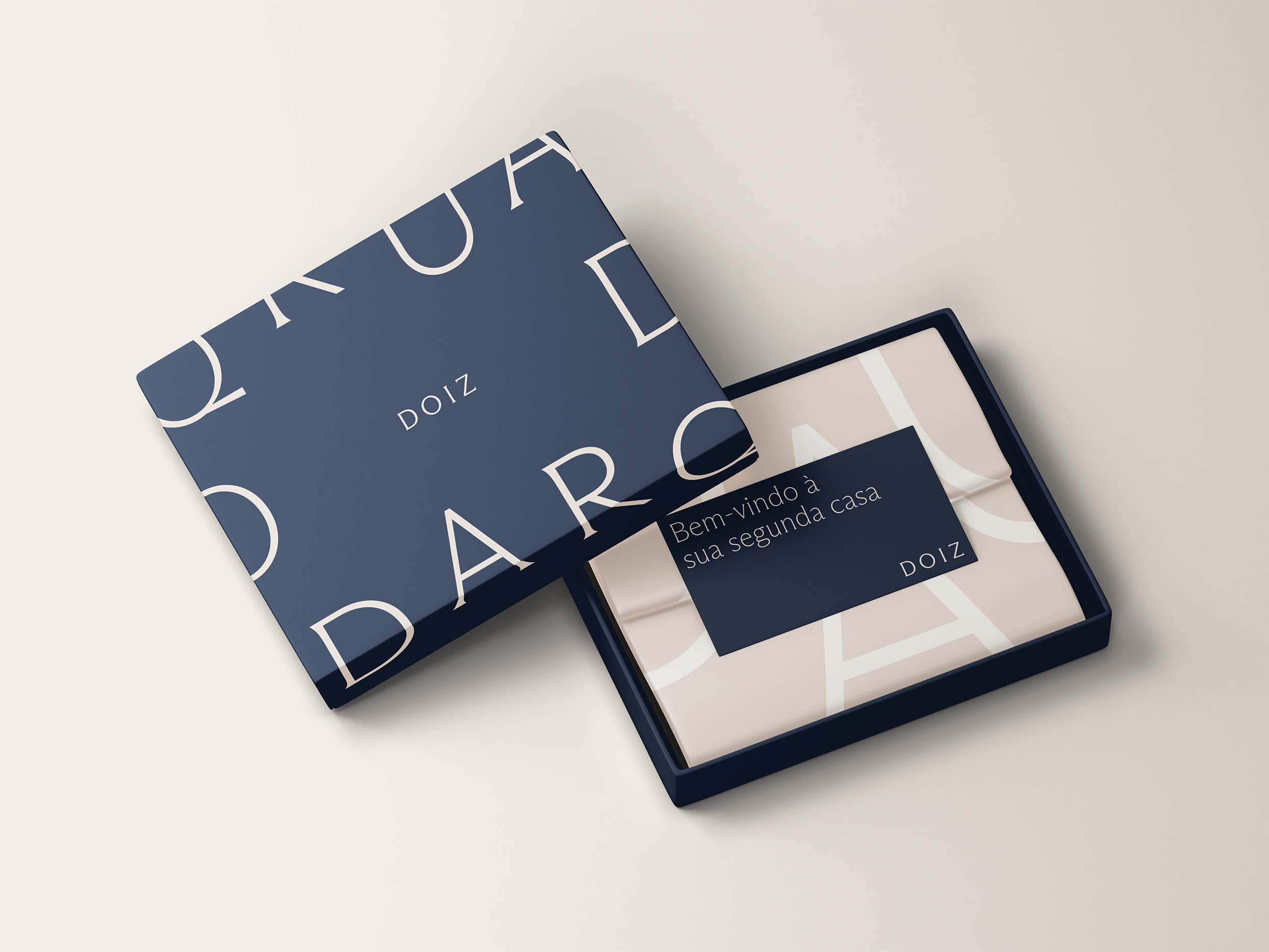
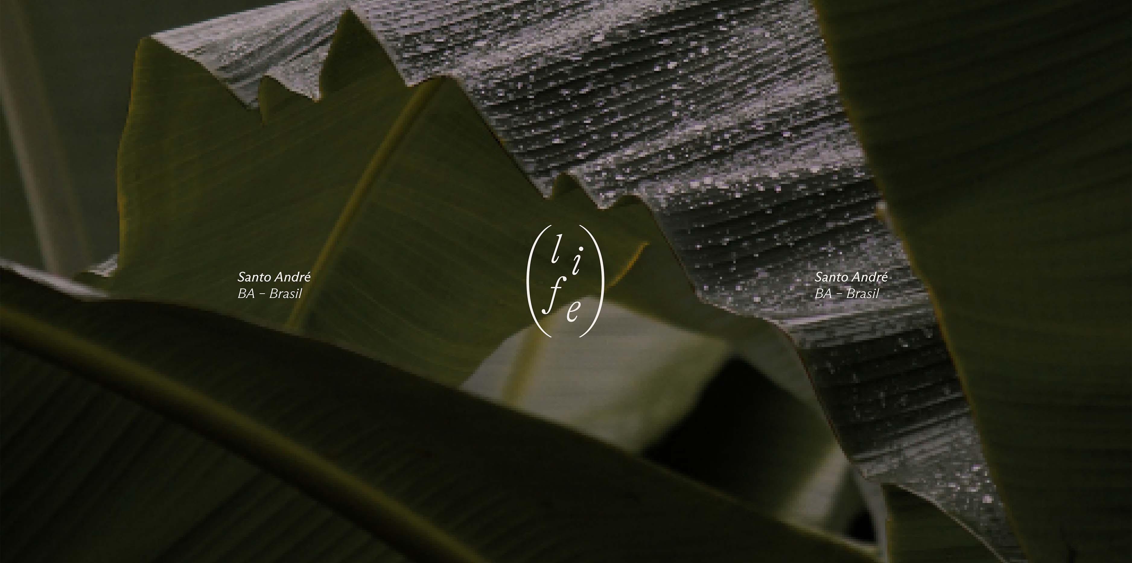
A Doiz é uma empresa que simplifica o processo da compra e aluguel de uma casa de férias. Para transmitir atributos como refúgio e segurança na identidade do empreendimento, partimos do aspecto de dualidade, presente até mesmo no nome da marca, buscando uma relação de complementaridade entre a linguagem da Doiz e da Doiz Life.
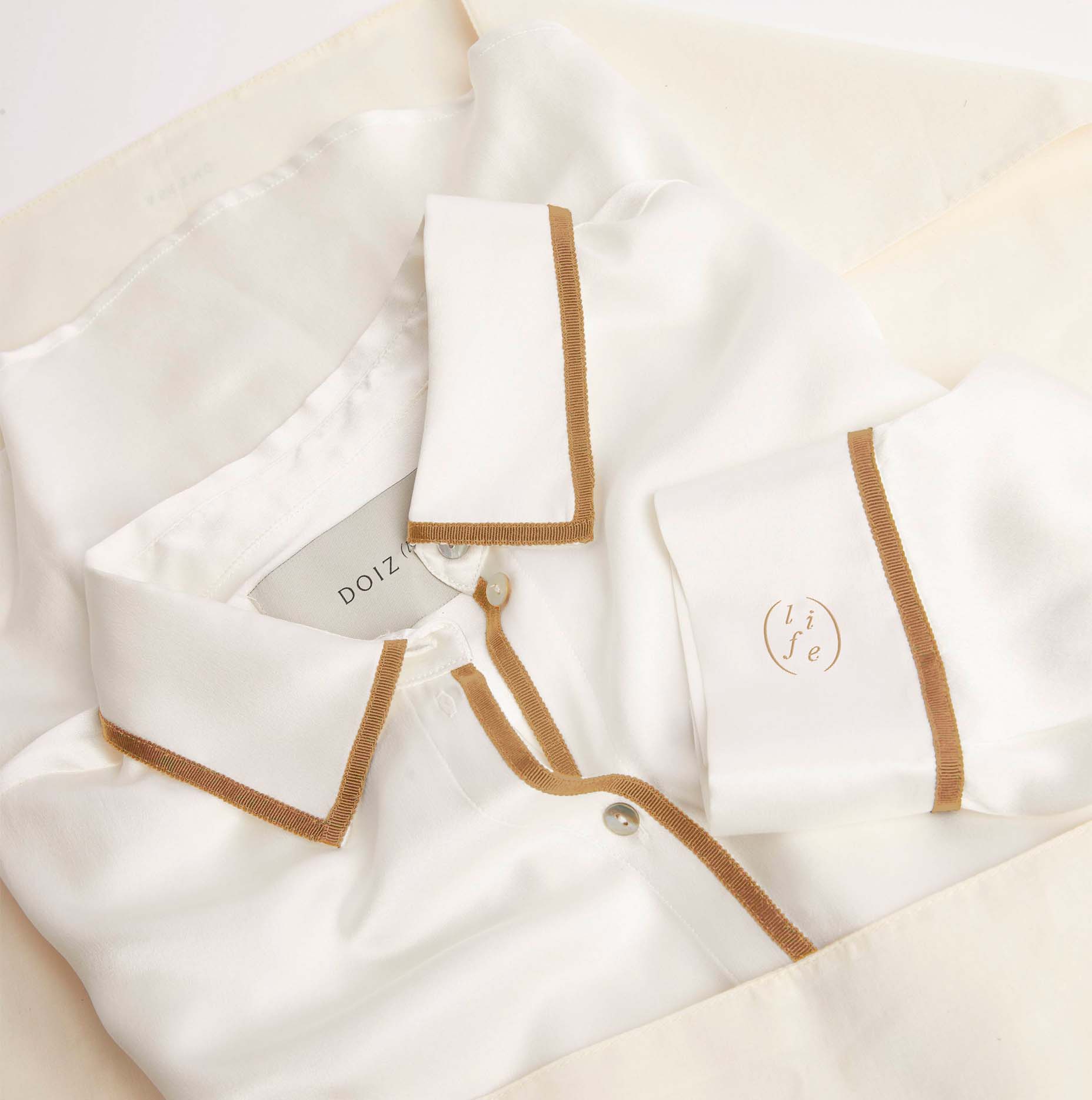
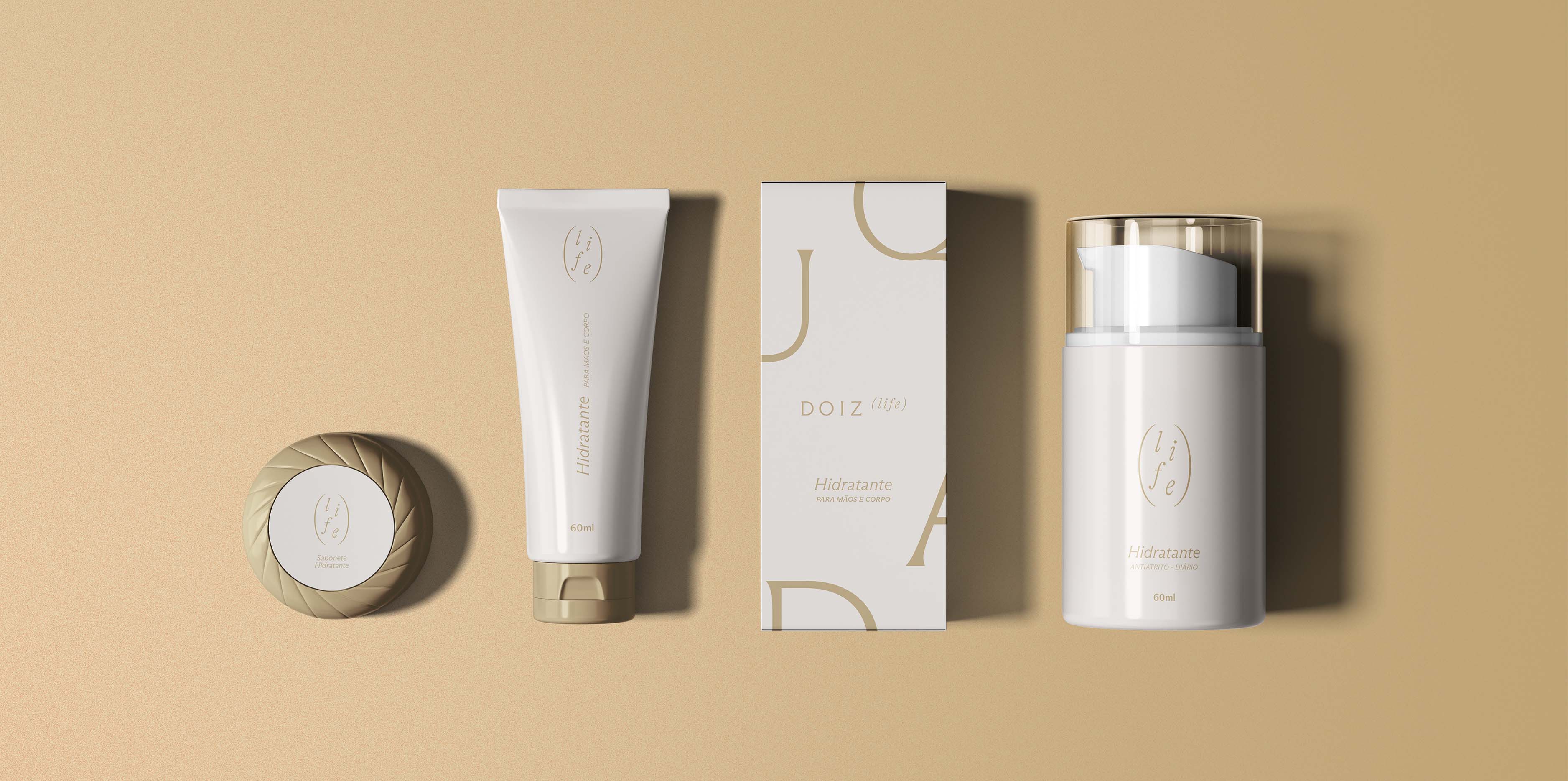
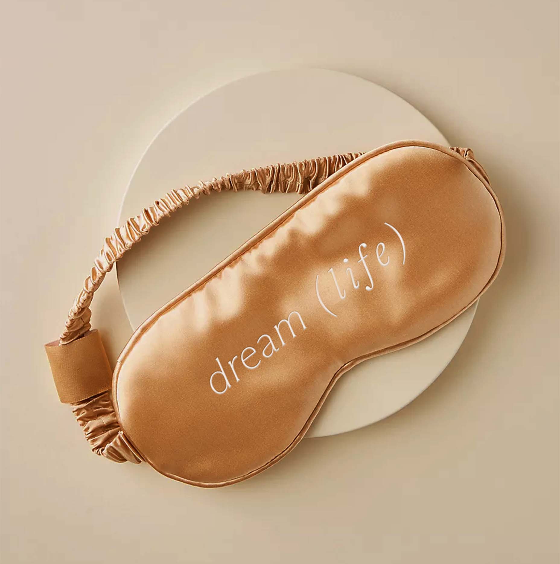
Nosso projeto para a marca principal é composto por uma tipografia que representa a solidez e confiança. O formato das letras simula uma serifa, traduzindo esses conceitos de forma fresca e contemporânea. Através do movimento, ainda exploramos o aspecto da inteligência. Já para a marca da Doiz Life, que oferece um serviço de hospitalidade, criamos uma assinatura que reflete leveza e tranquilidade.
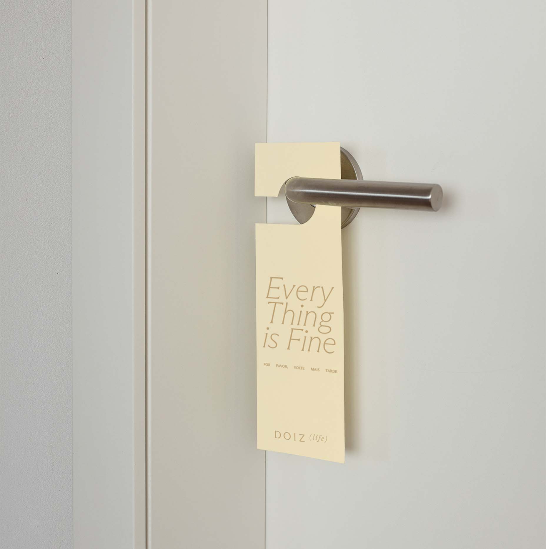
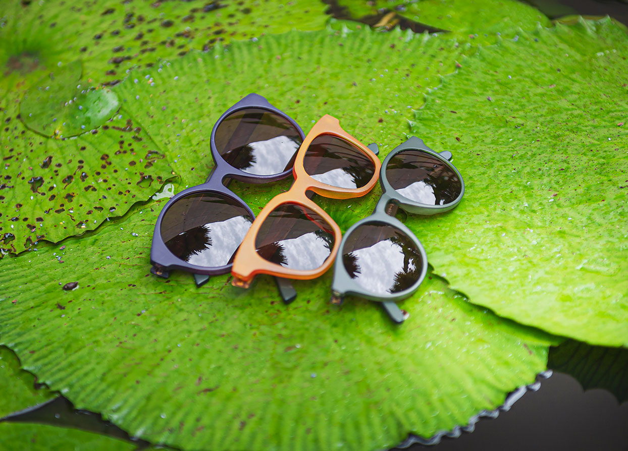
Na paleta cromática, optamos por tonalidades que dialogam com a experiência de aproveitar uma segunda casa. Nesse sentido, cores que remetem a lugares, como “Oceano” e “Campo”, e a sabores, como “Creme”, “Café” e “Chocolate”, reforçam a proposta de valor da empresa.
- Direção de Criação: Mariana Hardy
- Direção de Operações: Cynthia Massote
- Coordenação de Criação: Pedro de Albergaria
- Gerente de projeto: Beatriz Fonseca
- Designer: Tobia Hallak
- Motion designer: Thiago Guerreiro